How iPad Apps Adapt to the New 8.3" iPad Mini
This is the latest in a series of articles explaining how iOS and Watch apps appear when run on hardware that didn’t exist when they were designed and built.
On 20th September 2021, Apple announced a 6th Generation iPad Mini with an 8.3" screen. There are now seven different iPad resolutions (in landscape):
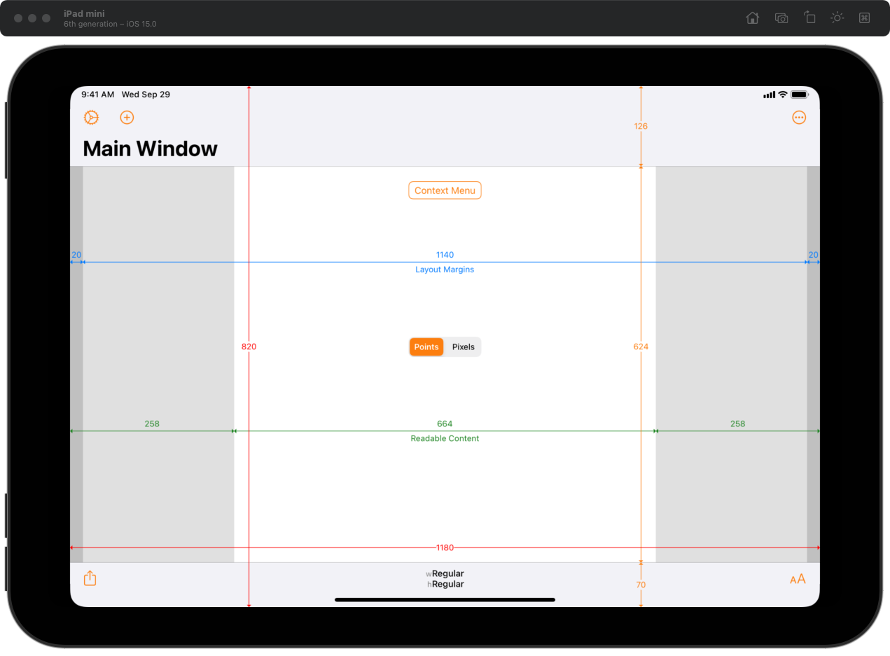
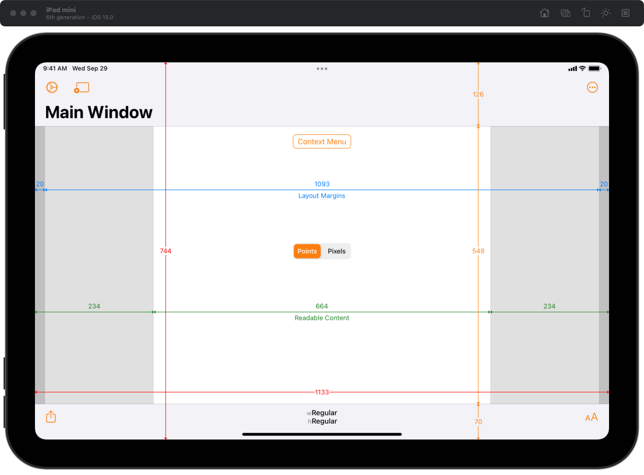
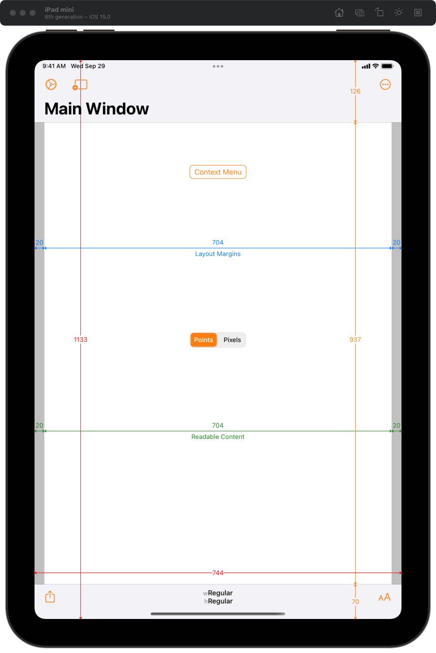
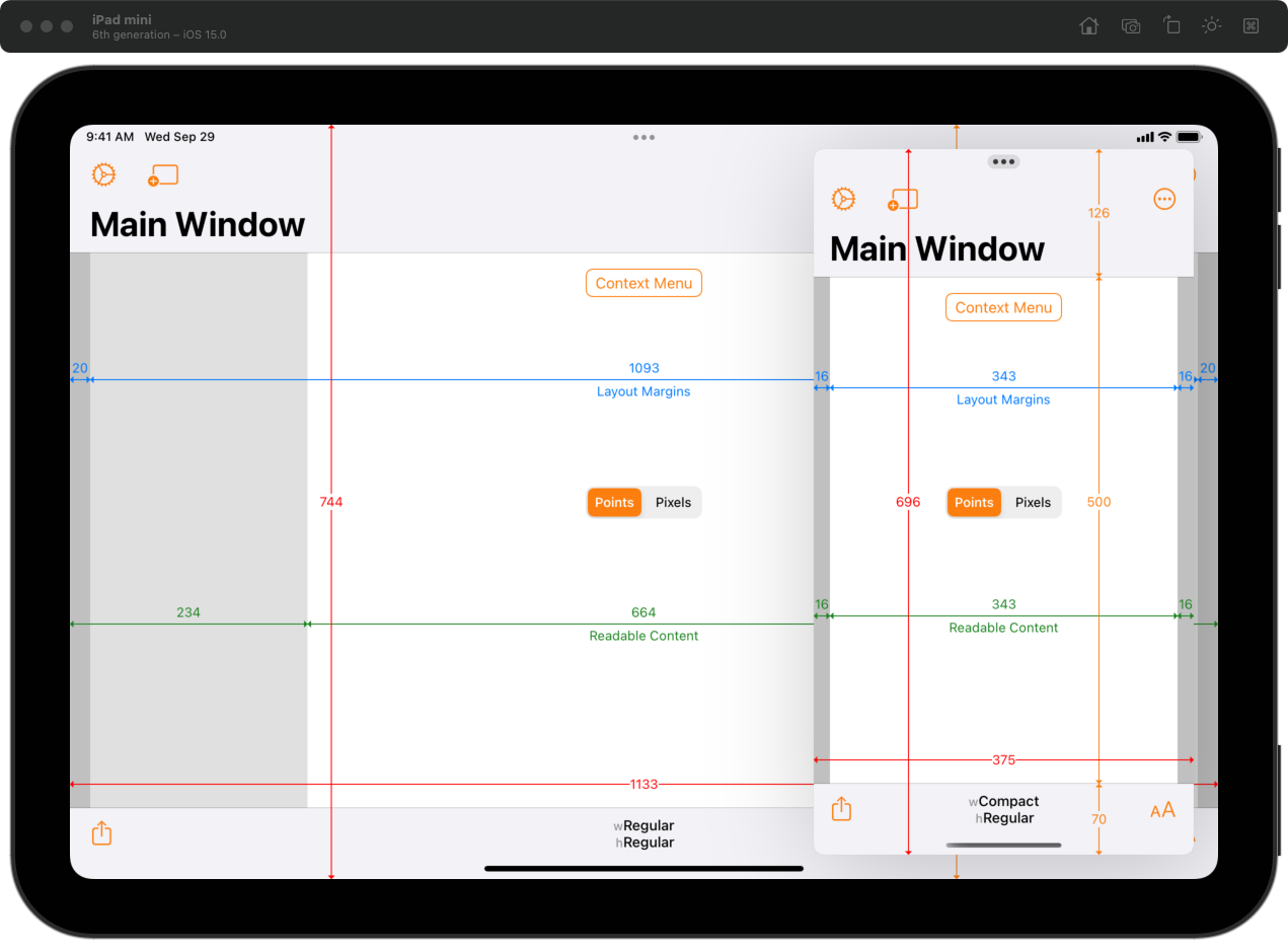
8.3": 1133×744 points (2266×1488 pixels)
9.7": 1024×768 points (2048×1536 pixels)
10.2": 1080×810 points (2160×1620 pixels)
10.5": 1112×834 points (2224×1668 pixels)
10.9": 1180×820 points (2360×1640 pixels)
11.0": 1194×834 points (2388×1668 pixels)
12.9": 1366×1024 points (2732×2048 pixels)
Previous iPad mini models had a 7.9" screen but the same resolution as the 9.7" iPad: 1024×768 points. Whilst it was physically smaller, from a development perspective it could be considered equivalent to the 9.7" models. The new iPad mini’s screen is wider and shorter (in landscape).
How does the 8.3" iPad mini display apps? As always, what happens depends on which version of Xcode an app was built with and whether the app requires full-screen or not.
Xcode 12 / iOS 14 Builds
Apps that were built with Xcode 12 or earlier (i.e. targetting iOS 14 or earlier) are unaware of the existence of the new 8.3" iPad screen size and its resolution.
Non-Multitasking Apps
iPad apps that do not support iPad multitasking (i.e. they have UIRequiresFullScreen set to YES in the Info.plist) will appear at the 10.9" 4th Generation iPad Air resolution, scaled to fit the height of the 8.3" iPad. It is letterboxed (black bars to the left/right) in landscape and pillar boxed (black bars to the top/bottom) in portrait. This scaling results in some slight blurring and scaling artefacts.

Xcode 13.0 / iOS 15.0 Builds
When built with Xcode 13.0 (i.e. linked against iOS 15.0) or later, apps get access to the native screen size of the 8.3" iPad mini whether they require full-screen or not.
Split Screen Multitasking
The 8.3" iPad mini shows two compact-width apps side-by-side when using a 50:50 split.
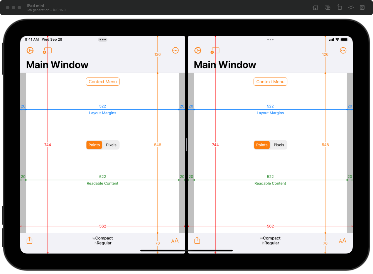
In an uneven split in landscape, the narrower app is 375 points (750 pixels) wide and compact width. The wider app is 748 points (1496 pixels) wide and regular width.

In an uneven split in portrait, the narrower app is 320 points (640 pixels) wide. The wider app is 414 points (828 pixels) wide. Both apps have compact width.

Slide Over
The 8.3" iPad mini shows compact-width Slide Over apps with a width of 375 points (750 pixels) in landscape and 320 points (640 pixels) in portrait.

iPhone-Only Apps
As descibed in my article How iPhone-only Apps Appear on iPad, iPhone-only apps run on iPad appear as pixel perfect iPhone 8 (and similar) at the small zoom size. Since iOS 12, iPhone apps on iPad are scaled at the larger zoom size to fill the screen (whilst maintaining the correct aspect ratio).
On the 8.3" iPad, the actual size on screen of an iPhone-only app is 750×1334 pixels un-zoomed and 1112×1978 pixels when zoomed. The latter is a 1112 / 375 ≈ 2.97 scaling factor.


Conclusion
In WWDC 2019: 224 Modernizing Your UI for iOS 13, the presenter discusses backward compatibility and states:
In the past if we introduced new hardware with a new screen size, your apps were letterboxed. Well, we’re not going to be doing that anymore either. So, if you application is built against the iOS 13 SDK, then it will always be displayed at the native full-screen resolution of the screen.
Despite this claim, the 8.3" iPad mini follows previous behaviour when new screen sizes are introduced: for apps built with a non-latest Xcode, full-screen apps are scaled, and multitasking-aware apps see the new screen size.
Apple have stated that from April 2022, all iOS and iPadOS apps will need to be built with Xcode 13 and the iOS 15 SDK.
Adaptivity
The screenshots in this article were taken from my Adaptivity app. Adaptivity is an app for developers and designers. It has tools to visualise how Size Classes and margins for layout, readable content and the safe area look on real devices and how they change with respect to orientation, iPad multitasking and Dynamic Type size changes. A comprehensive System Images view shows the different SF Symbols data sets across iOS versions with availability, localization and name change information. There are also views for visualising Dynamic Type styles, System Colors, System Fonts and System Materials. The app is a universal purchase and includes the Mac Catalyst version.
Testimonials, more screenshots and information on all the features is available on my web site.
