How Apps Adapt to the Series 4 Apple Watch Screen Sizes
Last year I wrote an article showing How iOS Apps Adapt to the iPhone X Screen Size. Earlier today I wrote this year’s equivalent: How iOS Apps Adapt to the iPhone XS Max and iPhone XR Screen Sizes. Apple’s September 2018 event also brought us new Apple Watch screen sizes for the first time since the Watch was released in April 2015.
Developers now have four different screen sizes to support:
38mm: 136×170 point (272×340 pixels)
42mm: 156×195 point (312×390 pixels)
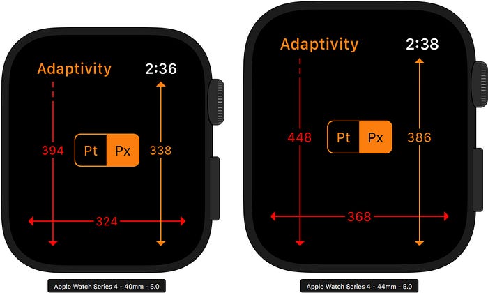
40mm: 162×197 point (324×394 pixels)
44mm: 184×224 point (368×448 pixels)
Apps have less control over layout in watchOS than in iOS and new screen sizes are going to cause problems. The edge-to-edge screens have large corner radii. The top corners affect the status bar, an area that only SpriteKit and SceneKit full screen Watch apps can actually use. The bottom corners mask quite a slice out of the app’s usable screen content (see screenshots below).
At the time of writing there’s just eight days before the September 21st 2018 release date of the new Watches. How will developers be ready with new versions in time (including waiting for app review in this very busy period)? Don’t worry, Apple has us covered.
38mm and 42mm Reference
As a reference, here’s how an Xcode 9 / watchOS 4 app appears on the 38mm and 42mm Watches:
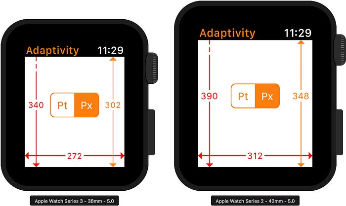
The status bar takes 19 points (38 pixels) and 21 points (42 pixels) away from the app on the 38mm and 42mm devices. Apps cannot show content underneath the status bar so I have used a dashed line for the screen height arrow to try and make it clear that the dimension refers to the entire screen height, not just the visible app (white) content.
Xcode 9 / watchOS 4
Apps built with Xcode 9 (i.e. targetting watchOS 4) are unaware of the existence of the newer 40mm and 44mm Watches. The same Xcode 9 / watchOS 4 app running on the new Watches run at their original 38mm and 42mm sizes, with the their original status bar heights (19 and 21 points):
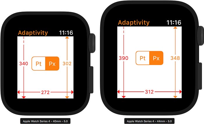
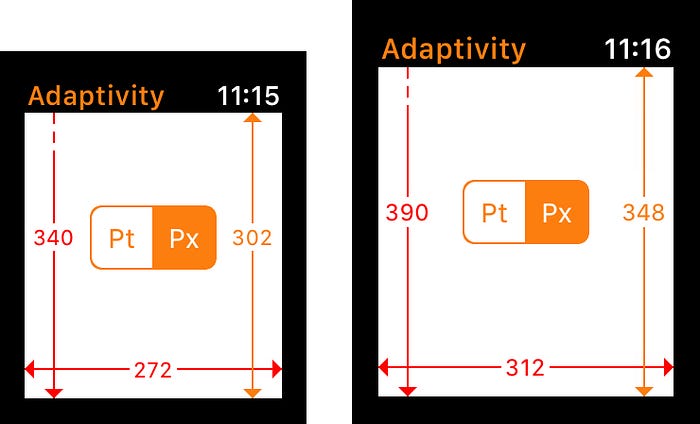
The deep black of the OLED screen will make it hard to notice, but the apps are letter- and pillar-boxed to appear in the middle of the larger screens:
Xcode 10 / watchOS 5
When built with the Gold Master version of Xcode 10, apps see the true nature of the 40mm and 44mm Watch screens:
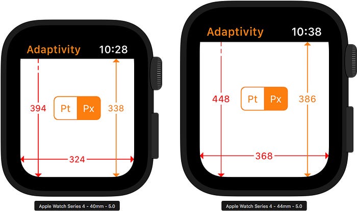
The status bar takes 28 points (56 pixels) and 31 points (62 pixels) away from the app on the 40mm and 44mm devices.
Note the very large corner radius at the bottom of the screen. I had to create custom layouts for Adaptivity to move the vertical and horizontal arrows further away from the edges in order to keep the arrowheads visible!
Apple have always recommended black rather than white backgrounds for Watch apps to blend into the device body. The Adaptivity app deliberately defaults to a white background in order to make the masking obvious. A dark background and careful layout can hide the effect but vertically scrolling apps will need special consideration:
Conclusion
As should now be expected, Apple have designed the 40mm and 44mm Watches and watchOS 5 to behave in a backwardly-compatible manner for apps that were built with Xcode 9 and can’t reasonably be expected to be able to fully support the new devices.
Rebuilding with Xcode 10 opts the developer into the larger screen sizes. For reasons I don’t fully understand yet, the Fixed to screen edges property for the top-level interface controller in the storyboard also had to be selected:

Without that option, an Xcode 10 build of Adaptivity would get the full width of the larger screens, a taller status bar but a reduced height for the app content that didn’t seem to match the size of earlier devices. Very strange!
How Did I Run Xcode 9 / watchOS 4 apps on watchOS 5 Simulators?
You might be wondering how I was able to capture screenshots from the Xcode 10 / watchOS 5 simulators with apps built with Xcode 9. My earlier article iPad Navigation Bar and Toolbar Height Changes in iOS 12 explains the process in the Wait, What Did You Say? section for the iPhone simulator.
It is possible to either drag the Xcode 9-built .app file for the Watch target onto the Watch simulator or to drag the Xcode 9-built .app file for the containing iOS app onto the iPhone simulator. If the iPhone simulator’s companion Watch simulator is running, the Watch app will automatically be installed. Just like on a real device!
Adaptivity iOS App
The screenshots in this article were taken from the watchOS simulator running my Adaptivity iOS app. Adaptivity is a tool for developers and designers to visualise the different screen sizes, layout margins, readable content guides, bar heights and Dynamic Type sizes that a modern, adaptive, iOS app uses when running on different devices and iPad multitasking sizes. The app is most useful for iPhone and iPad but I recently added a simple companion Watch app. More screenshots and information on all the features is available on my web site.
Other Articles That You Might Like
There is an iPhone-only version of Adaptivity to show How iPhone-only Apps Appear on iPad (it changed in iOS 12).
I have also written about External Display Support on iOS and Working with Multiple Versions of Xcode. You may not have realised that there were iPad Navigation Bar and Toolbar Height Changes in iOS 12. You must certainly have noticed the View Controller Presentation Changes in iOS 13.
If you found any of these articles helpful then please take a look at my apps in the iOS App Store to see if there’s anything that you’d like to download (especially the paid ones 😀). If you work with a lot of Xcode projects you might like my Mac Menu Bar utility XcLauncher.
