How iOS Apps Adapt to the iPhone XS Max and iPhone XR Screen Sizes
Last year I wrote an article showing How iOS Apps Adapt to the iPhone X Screen Size and noted that:
Apple have an excellent track record of providing backward compatibility with existing apps when new devices or versions of iOS are released. Apps are letter-boxed or zoomed to fit larger screen sizes. iOS will often behave like an earlier version to avoid breaking any assumptions that an older app might be making about its environment. Apple go to a lot of effort to try and make older apps function correctly on newer devices and iOS versions.
At their September 2018 event, Apple announced three new iPhone models: iPhone XS, iPhone XS Max and iPhone XR. The iPhone XS is the effectively same as last year’s iPhone X in terms of screen size and behaviour. If your app already supports the iPhone X it will appear the same on the iPhone XS. My earlier article describes how apps that don’t support the iPhone X will appear (i.e. letterboxed). We can ignore the iPhone XS for the purposes of this article; the bigger screen sizes are the interesting cases.
The 6.5" iPhone XS Max is to the 5.5" plus size iPhones as the 5.8" iPhone X (and XS) is to the 4.7" iPhones: almost the same physical body size but with an edge-to-edge OLED screen using 3 pixels per point. The iPhone XS Max has the same screen width in points as the plus size iPhones but is correspondingly taller to account for the 9:19.5 aspect ratio. The iPhone XS Max has a screen size of 414×896 points (1242×2688 pixels).
The 6.1" iPhone XR is effectively a 2x version of the iPhone XS Max with the same pixel density as the iPhone 6/6s/7/8 models. The iPhone XR has a screen size of 414×896 points (828×1792 pixels).
How do the iPhone XS Max and iPhone XR display apps on their larger screens? Just like last year with the iPhone X, that depends on which version of Xcode the apps were built with. For the purposes of this article we can treat the iPhone XS Max and iPhone XR together. What happens with apps on the iPhone XS Max will also happen on the iPhone XR, just at 2x instead of 3x.
iPhone X Reference
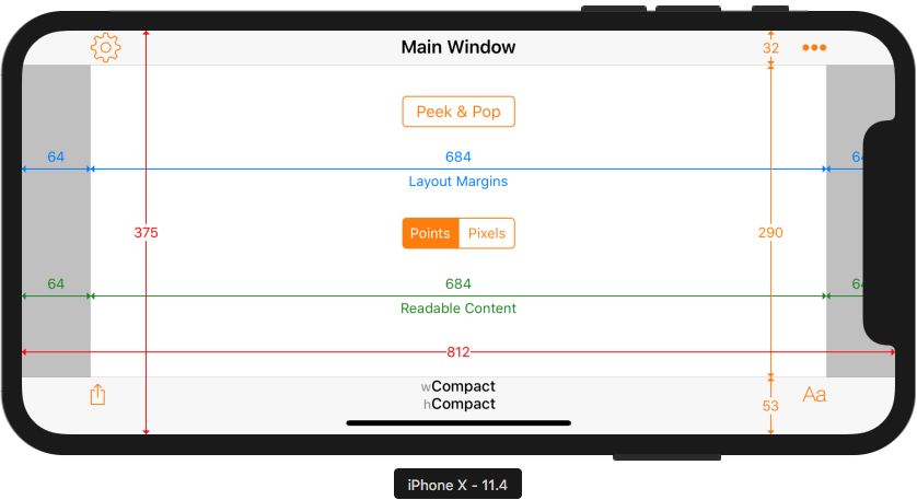
As a reference, here’s how an Xcode 9/ iOS 11 app appears on the iPhone X at its native resolution:

This shows the familiar 375×812 point screen size of the iPhone X with its large navigation bar and toolbar heights to keep content away from the notch and Home Indicator.
In landscape the status bar is hidden and the bars are reduced in height:
Xcode 9 / iOS 11
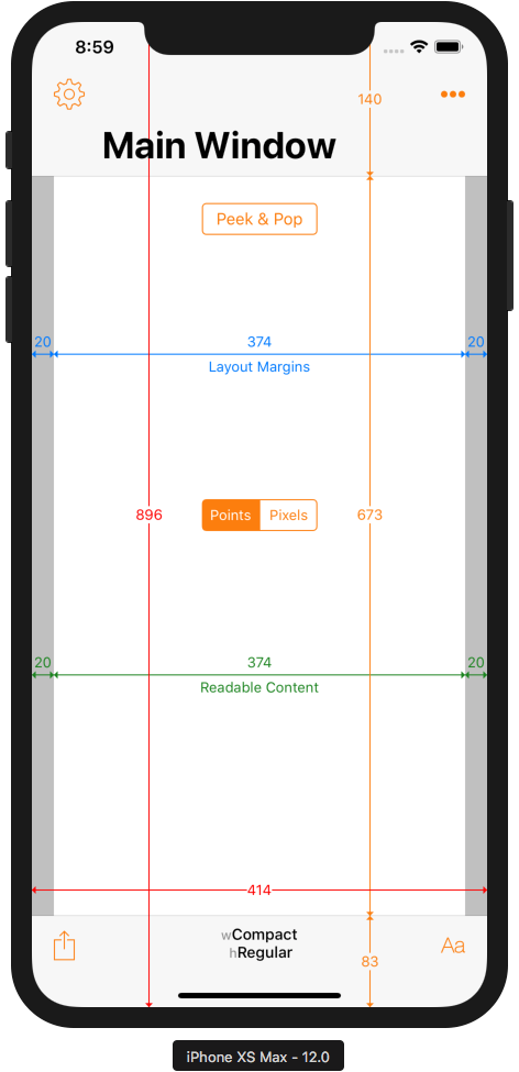
Apps that were built with Xcode 9 (i.e. targeting iOS 11) are unaware of the existence of the iPhone XS Max screen size. The same Xcode 9 / iOS 11 app running on the new iPhone XS Max (or iPhone XR) is simply zoomed to fill the larger screen:


Zooming will result in some bluriness but at the high pixel density will be difficult to notice in practice. Note the compact width horizontal size class in landscape — just like on the iPhone X. Thanks to Apple’s backwards compatibility, the iPhone XS Max is behaving exactly like an iPhone X would when running an app built with Xcode 9 / iOS 11.
Xcode 10 / iOS 12
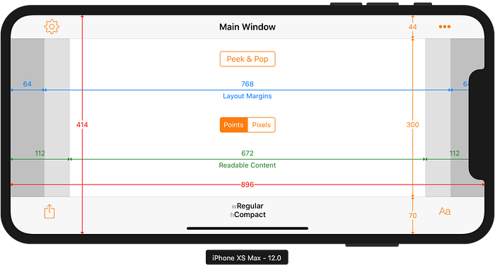
When built with the Gold Master version of Xcode 10, apps see the true nature of the iPhone XS Max and iPhone XR screens:
The full resolution of the screen is now available. Layout margins have increased slightly from 16 points to 20 points, which is consistent with the behaviour of the plus size iPhones.
In landscape things are more interesting:
The navigation and toolbars are not reduced in height quite as much as on the iPhone X. Note also that the iPhone XS Max has a regular width size class in landscape. This is also consistent with behaviour on the plus size iPhones. The readable content guide margins, however, are different to the layout margins. That is different to the behaviour on plus size iPhones.
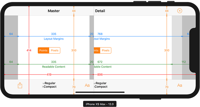
More differences in behaviour can be seen with Split View Controllers in landscape. The plus size iPhones show both Master and Detail views side-by-side:
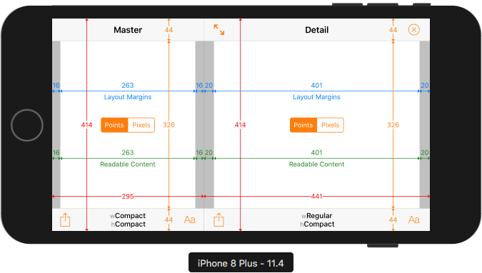
With default configuration, the iPhone XS Max shows a full screen Detail view that is essentially the same as the Main Window screenshot shown earlier. The Master view appears as a slide over and is considerably wider than the Master view on the plus size iPhones:
Conclusion
As should now be expected, Apple have designed the iPhone XS Max, iPhone XR and iOS 12 to behave in a backwardly-compatible manner for apps that were built with Xcode 9 and can’t reasonably be expected to be able to fully support the new devices. Even apps that use auto layout and have launch storyboards will be shown zoomed to fill the larger screen. Rebuilding with Xcode 10 opts the developer into the larger screen size.
EDIT: I have written a similar articles on How Apps Adapt to the Series 4 Apple Watch Screen Sizes, How iPad Apps Adapt to the New 11" and 12.9" iPads Pro and How iPad Apps Adapt to the New 10.2" iPad.
How Did I Run Xcode 9 / iOS 11 apps on iOS 12 Simulators?
You might be wondering how I was able to capture screenshots from the Xcode 10 / iOS 12 simulators with apps built with Xcode 9. My earlier article iPad Navigation Bar and Toolbar Height Changes in iOS 12 explains the process in the Wait, What Did You Say? section.
Adaptivity iOS App
The screenshots in this article were taken from the iOS simulator running my Adaptivity iOS app. Adaptivity is a tool for developers and designers to visualise the different screen sizes, layout margins, readable content guides, bar heights and Dynamic Type sizes that a modern, adaptive, iOS app uses when running on different devices and iPad multitasking sizes. More screenshots and information on all the features is available on my web site.
Other Articles That You Might Like
There is an iPhone-only version of Adaptivity to show How iPhone-only Apps Appear on iPad (it changed in iOS 12).
I have also written about External Display Support on iOS and Working with Multiple Versions of Xcode. You may not have realised that there were iPad Navigation Bar and Toolbar Height Changes in iOS 12. You must certainly have noticed the View Controller Presentation Changes in iOS 13.
If you found any of these articles helpful then please take a look at my apps in the iOS App Store to see if there’s anything that you’d like to download (especially the paid ones 😀). If you work with a lot of Xcode projects you might like my Mac Menu Bar utility XcLauncher.
