How iPad Apps Adapt to the New 11" and 12.9" iPads Pro
This is the latest in a series of articles explaining how iOS and Watch apps appear when run on hardware that didn’t exist when they were designed and built. Previous articles focused on the iPhone X, iPhone XS Max & XR, and Series 4 Apple Watch:
- How iOS Apps Adapt to the iPhone XS Max and iPhone XR Screen Sizes
- How Apps Adapt to the Series 4 Apple Watch Screen Sizes
- How iOS Apps Adapt to the iPhone X Screen Size
On 30th October 2018, Apple announced two new iPads with Face ID, edge-to-edge LCD screens and no home button. There are now four different iPad screen resolutions (in landscape):
9.7": 1024×768 points (2048×1536 pixels)
10.5": 1112×834 points (2224×1668 pixels)
11.0": 1194×834 points (2388×1668 pixels)
12.9": 1366×1024 points (2732×2048 pixels)
The new 12.9" iPad Pro has the same screen resolution as previous models in a smaller body, whilst the new 11" iPad Pro is a new screen size in a body very similar to the 10.5" iPad. Note that the 11" iPad Pro has the same height (in landscape) as the 10.5" iPad Pro but is 82 points (164 pixels) wider. I.e., it only changes size on the longer dimension.
How do the new iPad Pro devices display apps? That depends on which version of Xcode the apps were built with. It’s a little more complicated this time around. Older apps running on the new hardware effectively see two new screen resolutions that don’t match any previous or new devices. It’s a new kind of hybrid screen resolution…
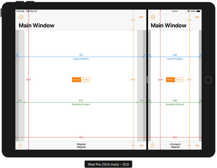
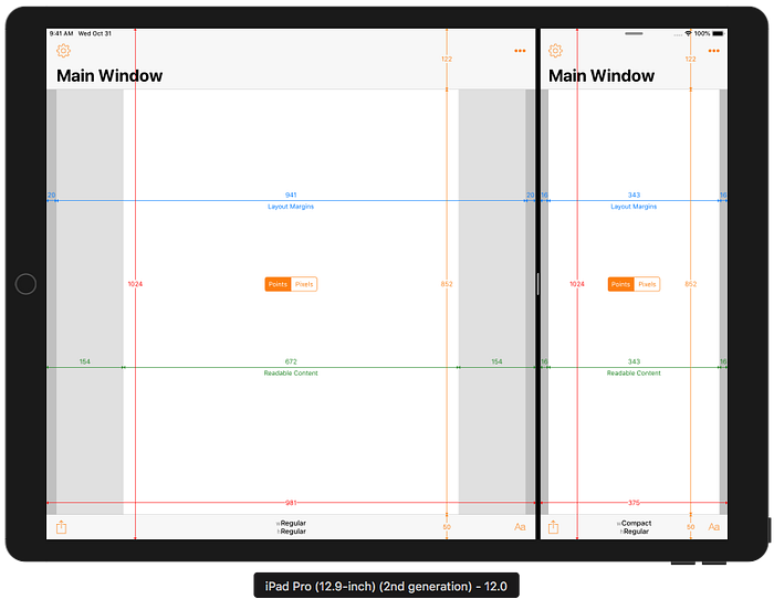
10.5" and 1st/2nd Generation 12.9" iPad Pro and iOS 12.0 Reference
Full Screen
As a reference, here’s how an Xcode 10.0 / iOS 12.0 app appears on the 10.5" and 1st/2nd generation 12.9" iPad Pro devices at their native resolution:


The status bar is 20 points (40 pixels) tall. If you weren’t aware, iOS 12.0 changed the heights of navigation bars, toolbars and tab bars on iPad for apps built with Xcode 10.0 and later.
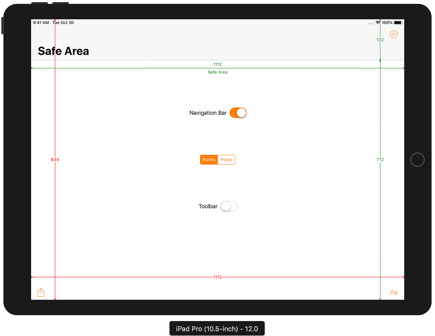
Safe Area
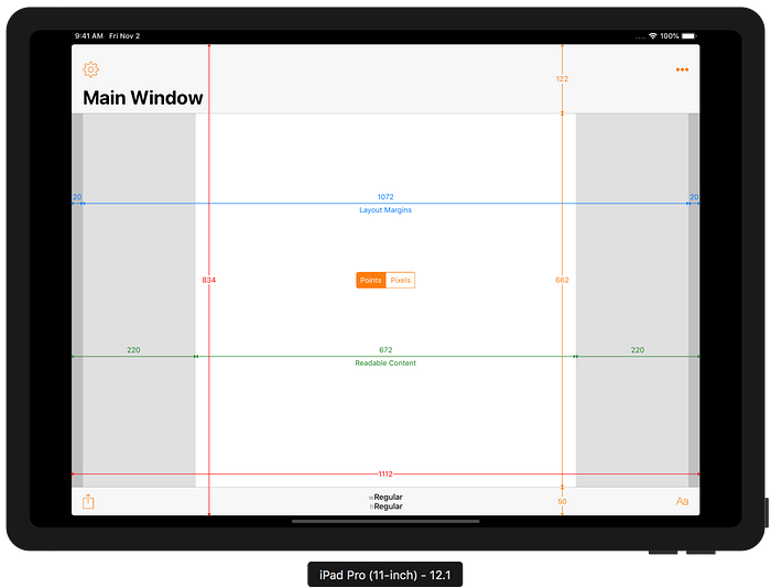
For all previous iPad devices (and, spoiler alert, also the new devices), the Safe Area only excludes the status bar, navigation bar, toolbar and tab bar (where appropriate). For example, the 10.5" iPad Pro showing a status bar and large navigation bar has a top safe area inset of 122 points (244 pixels) on iOS 12.x (it was slightly smaller on iOS 11):
Split Screen Multitasking
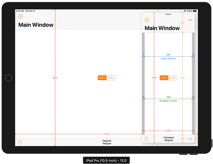
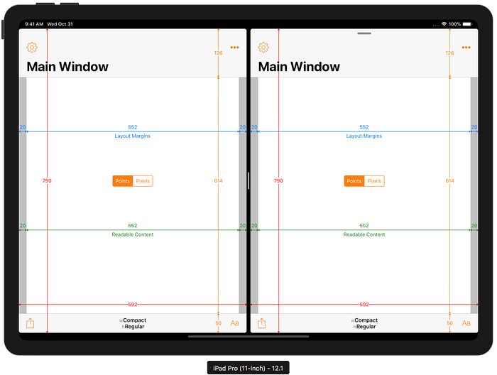
The 9.7" and 10.5" iPads Pro show two compact-width apps side-by-side when using a 50:50 split. In an uneven split, the wider app has regular width and the narrower app has compact width. The narrower app is 320 points (640 pixels) wide, the same as a 3.5" or 4" iPhone, in both landscape and portrait and the wider app occupies the remaining space (so it is wider on the 10.5" than the 9.7"):
The 12.9" iPad Pro shows two regular-width apps side-by-side when using a 50:50 split. In an uneven split, the narrower app has compact width and is 375 points (750 pixels) wide in landscape, the same as a 4.7" iPhone 6/6S/7/8 or iPhone X/XS, and 320 points (640 pixels) in portrait:
Slide Over
The 9.7" and 10.5" iPads Pro show a compact-width Slide Over app with a width of 320 points (640 pixels) in both landscape and portrait. The height is 40 points shorter than the full screen height (20 points inset from the top to avoid obscuring the status bar and 20 points inset from the bottom to keep it vertically centred):
The 12.9" iPad Pro shows a compact-width Slide Over app with a width of 375 points (750 pixels) wide in landscape and 320 points (640 pixels) in portrait:
Xcode 10.0 / iOS 12.0 Builds
Apps that were built with Xcode 10.0 or earlier (i.e. targeting iOS 12.0 or earlier) are unaware of the existence of the new 11" iPad Pro screen size or a 12.9" iPad Pro with a Home Indicator (instead of a Home Button).
From previous experience with older apps running on newer devices one might expect that Xcode 10.0-built apps would see the exact same screen resolution as the previous 10.5" and 12.9" iPads, and be scaled, pillar- or letter-boxed to fit the new screens and avoid the Home Indicator overlapping the app content. For the first time ever to my knowledge, that’s not what happens (except for apps that require full screen) 😲.
Full Screen
iPad apps that do not support iPad multitasking (i.e. they have UIRequiresFullScreen set to YES in the Info.plist) will appear at their original 9.7" or 10.5" iPad resolution on the 11" iPad. Which version is used depends on whether a 10.5" launch image or a launch storyboard (which opts into 10.5" iPad support) is present. The apps are scaled to almost fill the screen of the 11" iPad. Similarly, the 1st and 2nd generation 12.9" iPad resolution is scaled to almost fill the screen on the 3rd generation 12.9" iPad. The status bar and Home Indicator are effectively outside of the screen area. In order to maintain a 4:3 aspect ratio, the app is also inset on the left and right edges. Of course, this will introduce some scaling artefacts.
Instead of scaling to fit, older apps that do support multitasking (which effectively declares them as somewhat adaptive) appear in a Compatibility Mode with a screen size that doesn’t match earlier devices or the full size of the new devices. The status bar and Home Indicator are still outside of the screen area that the app occupies.
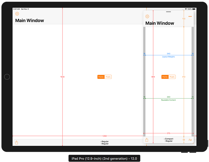
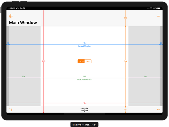
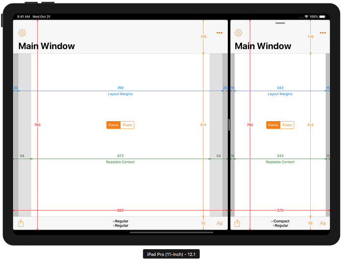
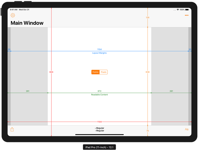
In portrait, the 11" iPad Pro will show old apps at the same width as the 10.5" iPad Pro, but with a slightly taller height (1150 points on the 11" as against 1112 points on the 10.5"):
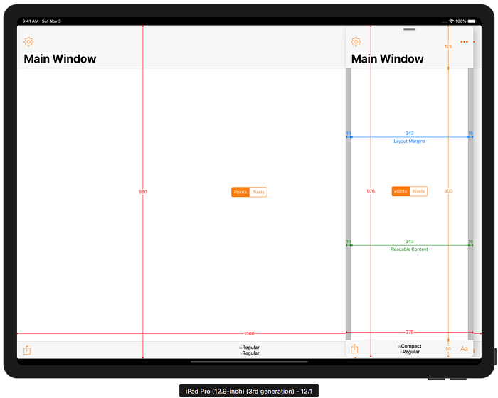
In landscape, the 11" iPad Pro has a screen size that combines the full width of the 11" screen with a reduced height that does not match any previous device:
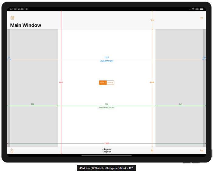
Note also that the height of the large navigation bar has increased from 122 to 126 points (244 to 252 pixels). As we will see later, this is actually due to an increase in height of the status bar from 20 to 24 points (40 to 48 pixels) on these devices. This happens even though the status bar is not actually part of the app’s screen area in this special compatibility mode!
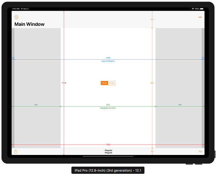
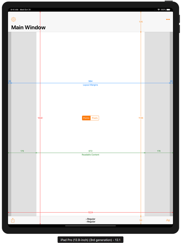
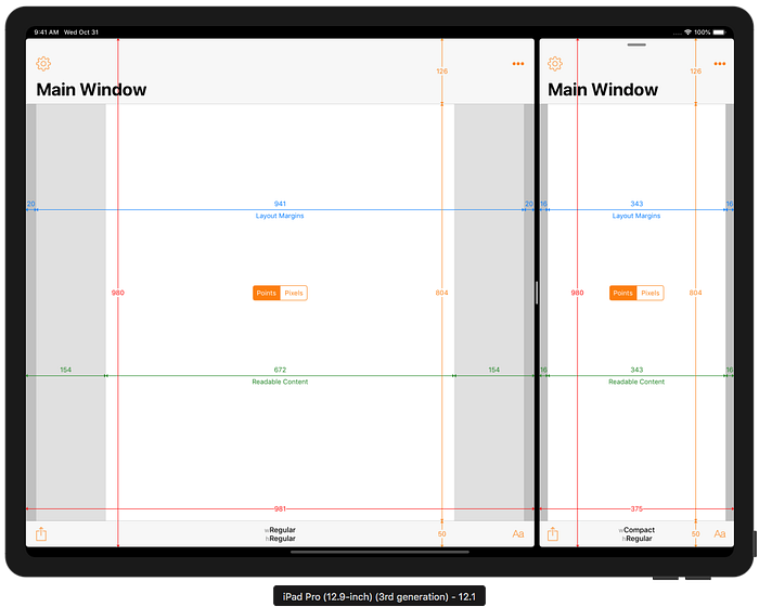
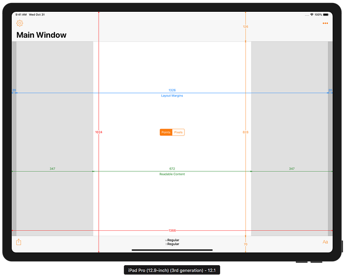
Xcode 10.0 builds also run in a compatibility mode on the new 12.9" iPad Pro. Again, the status bar and Home Indicator are not part of the app’s screen, resulting in a height that is unlike any previous device:
Safe Area
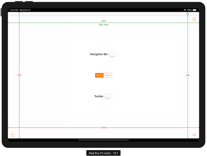
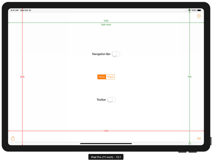
Xcode 10.0-built apps running on the new devices see similar Safe Area behaviour as before, except that the status bar is 24 points rather than 20 points tall. The new iPads do not have leading/trailing safe area insets, in either orientation. With no notch and smaller rounded corners compared to the iPhones X the usual leading/trailing layout margins should be wide enough to avoid UI elements appearing too close to the corners.
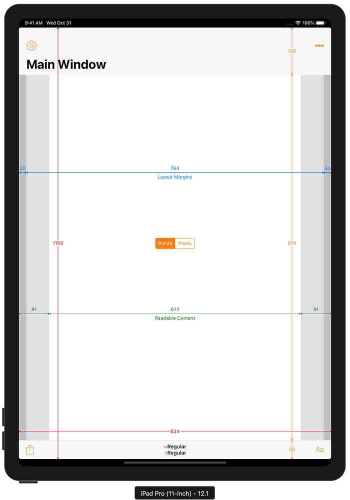
For example, the 10.5" iPad Pro without a navigation bar or toolbar has a top safe area inset of 24 points, even in compatibility mode where the status bar is outside the app’s screen area.
Split Screen Multitasking
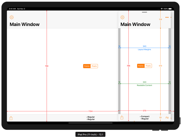
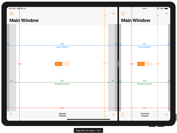
Older apps running in split screen multitasking on the new iPads also see a screen size unlike any previous devices. As with full screen apps, the status bar and Home Indicator sit outside the app’s accessible area. A 50:50 split on the 11" iPad still gives two regular-width apps, but the actual widths are different (to fill the wider screen):
In an uneven split, the narrow app is 375 points wide in landscape instead of the 320 points it has been on previous 9.7" and 10.5" iPads (i.e the same as on previous 12.9" iPads in landscape). In portrait, the narrower app remains 320 points wide on all iPads.
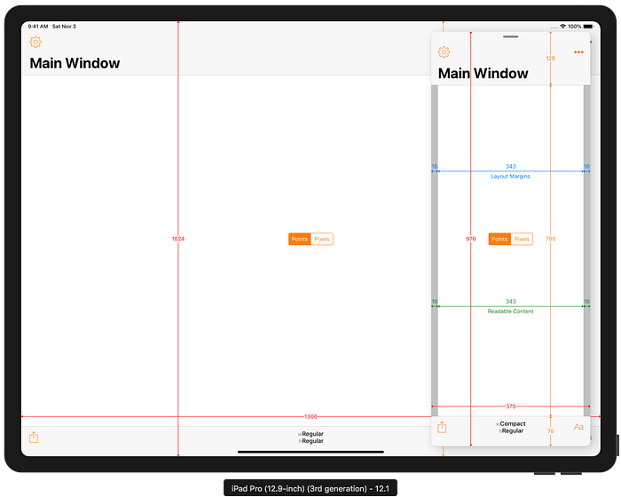
Old apps running on the new 12.9" iPad also have reduced height to account for the status bar and Home Indicator. The narrower app in an uneven split remains 375 points wide in landscape and 320 points wide in portrait:
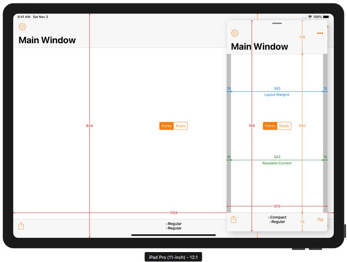
Slide Over
Older apps running in Slide Over on the 11" iPad have a width of 375 points in landscape and 320 points in portrait. As with the iPad 10.5" reference, the height is two status bar heights shorter than the height of the screen. The status bar is 24 points tall on the 11" iPad so this means the Slide Over app on the 11" iPad is 8 points shorter than on the 10.5" iPad.
As we’ve already seen, an old full screen app is inset by 24 points at the top to avoid the status bar and 20 points at the bottom to avoid the Home Indicator. This leads to a slightly awkward appearance where the Slide Over app is 4 points shorter than the old full screen app (they align at the top, but not the bottom).
Similar results are seen on the 3rd generation 12.9" iPad Pro:
Xcode 10.1 / iOS 12.1 Builds
When built with Xcode 10.1 (i.e. linked against iOS 12.1), apps get access to the full 11" and 12.9" screen sizes of the new devices.
Full Screen
The status bar is the same height as in compatibility mode (24 points) but is now part of the app’s screen area. The toolbar (and tab bar) are 20 points taller to leave space for the Home Indicator:
Safe Area
Updated apps see the same top safe area inset for the status bar (which is now actually part of the app) and a new bottom inset due to the Home Indicator. There is no leading/trailing inset in either orientation:
Split Screen Multitasking
Updated apps in split screen also see the full height with the taller status bar and a taller toolbar to account for the Home Indicator. As with compatibility mode, the narrower app in an uneven split is 375 points wide on both the new 11" and 12.9" devices in landscape and 320 points wide in portrait:
In one of its new developer videos, Apple warn that both apps in split screen will be forced into compatibility mode if either of them have not been updated to support the new devices. So, even if you rebuild with Xcode 10.1, your app might find itself in a new screen size when paired with an older app.
Slide Over
An updated app appears at the same size in Slide Over as an older app. Note, however, that the toolbar is 20 points taller (70 points instead of the 50 points that older apps see on the all iPads running iOS 12.x):
Similar results are seen on the 3rd generation 12.9" iPad Pro:
Conclusion
In a deviation from the norm, Apple have designed the new 11" and 12.9" iPads Pro to behave in an almost backwardly-compatible manner for multitasking-capable apps that were built with Xcode 10.0 or earlier. Older apps see full screen, split screen multitasking and Slide Over sizes which are unlike any previous or current device. Even apps that use auto layout and have launch storyboards will be shown in this compatibility mode.
Apps that do not support multitasking (UIRequiresFullScreen is set to YES in the Info.plist) will retain their 10.9" or 10.5" effective resolution and be inset to avoid the status bar and Home Indiciator.
Apple have been warning developers not to make assumptions about bar sizes for several years. They have strongly recommended using the Safe Area for layout since iOS 11 and the iPhone X. Developers who heeded this advice should have little to no work to do. Their existing Xcode 10.0 builds will work (at a slightly unusual and never-before-seen resolution) on the newer devices. Rebuilding with Xcode 10.1 will take advantage of the full screen size of the new iPads and avoid the Home Indicator. That might be all they need to do.
On the other hand, apps which aren’t adaptive, assume bar heights or screen sizes, are possibly going to have some layout problems. In a change from previous years and devices, running existing multitasking-capable apps on the new iPads will result in different behaviour.
More Resources
Apple have produced two short videos to help developers make their apps work well with the new iPad Pro devices and Apple Pencil:
How Did I Run Xcode 10.0 / iOS 12.0 apps on iOS 12.1 Simulators?
You might be wondering how I was able to capture screenshots from the Xcode 10.1 / iOS 12.1 simulators with apps built with Xcode 10.0. My earlier article iPad Navigation Bar and Toolbar Height Changes in iOS 12 explains the process in the Wait, What Did You Say? section.
Adaptivity iOS App
The screenshots in this article were taken from the iOS simulator running my Adaptivity iOS app. Adaptivity is a tool for developers and designers to visualise the different screen sizes, layout margins, readable content guides, bar heights and Dynamic Type sizes that a modern, adaptive, iOS app uses when running on different devices and iPad multitasking sizes. More screenshots and information on all the features is available on my web site.
Other Articles That You Might Like
There is an iPhone-only version of Adaptivity to show How iPhone-only Apps Appear on iPad (it changed in iOS 12).
I have also written about External Display Support on iOS and Working with Multiple Versions of Xcode. You may not have realised that there were iPad Navigation Bar and Toolbar Height Changes in iOS 12. You must certainly have noticed the View Controller Presentation Changes in iOS 13.
If you found any of these articles helpful then please take a look at my apps in the iOS App Store to see if there’s anything that you’d like to download (especially the paid ones 😀). If you work with a lot of Xcode projects you might like my Mac Menu Bar utility XcLauncher.
