SF Symbols Changes in iOS 14.0
Introduction
In WWDC 2019: 206, Introducing SF Symbols Apple announced a great new resource for iOS developers:
SF Symbols introduces a comprehensive library of vector-based symbols that you can incorporate into your app to simplify the layout of user interface elements through automatic alignment with surrounding text, and support for multiple weights and sizes.
By the time iOS 13 was released there were 1,672 symbols available for developers to use in their own apps. However, 59 of them are restricted and can only be used to refer to particular Apple technologies such as iCloud or the Messages app.
There are a number of articles which describe how to use the symbols in your apps. One that I found particularly comprehensive is SF Symbols in iOS 13 by Antoine van der Lee.
SF Symbols 2
At WWDC 2020, Apple announced a significant update: SF Symbols 2:
… And we’ll walk you through the latest updates, including additions to the repertoire, alignment improvements, changes with right-to-left localization, and multicolor symbols.
The iOS Human Interface Guidelines have been updated to discuss the new symbols and an updated version of Apple’s SF Symbols Mac app is now available. I have found that the app has not been kept up to date with changes in the various iOS beta versions.
SF Symbol Browsing Apps
To make it easy to browse and search the available symbols, Apple released their SF Symbols Mac app back in 2019:
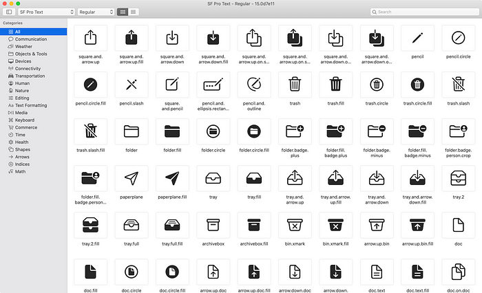
In 2020 this has been updated to version 2.0 and supports SF Symbols 2. At the time of writing, the latest build (40) includes the symbols as of the public release of iOS 14.
A number of iOS apps are available on the App Store for browsing SF Symbols. There are even some with source code available on GitHub, such as this one by An Trinh.
My own Adaptivity app is a tool for iOS developers and designers, and one of its many features is a view to browse SF Symbols.

I am obviously biased, but I think Adaptivity is an incredibly useful app for browsing SF Symbols (and much more). When run on iOS 13, Adaptivity can obviously only show symbols that are available on iOS 13. When run on iOS 14, there is a button in the lower right of the System Images category list to choose whether to view the symbols available in iOS 13 or iOS 14.
I have spent far more time than I care to admit tracking symbol changes across iOS 14 beta versions to keep Adaptivity up to date. Version 7.1 has the same categories as SF Symbols v2.0 (build 40).
Changes in SF Symbols 2
In this article I want to focus on the changes to SF Symbols in iOS 14. I’ll refer to iOS versions for simplicity, but SF Symbols are also supported in watchOS 6 and 7, tvOS 13 and 14, Mac Catalyst apps, and native Mac apps as of macOS 11 Big Sur.
There are far too many changes to list them all in detail and Apple made updates during the iOS 14 beta cycle. The changes fall into several different categories:
- New symbols Almost 900 new symbols have been added. Some have restricted usage.
- Renamed symbols 60 symbols from iOS 13 have been renamed.
- Multicolor symbols 158 symbols have multicolor support.
- Localized variants More right-to-left localized symbols. More localized versions of symbols which include punctuation or numeric digits.
- Bug Fixes A few symbols that didn’t match their names have been fixed.
New Symbols
Version 2 of Apple’s SF Symbols app added a ‘What’s New’ category to highlight the new symbols. I have added the same category to Adaptivity when viewing the iOS 14 symbols. There are 987 symbols in this category, but some of them are renamed versions of existing iOS 13 symbols (see below for more information).
The difference in the symbol count in the ‘All’ category between iOS 14 and iOS 13 indicates a total of 2,571 − 1,672 = 899 new symbols. Some are variants of existing symbols with support for right-to-left localization, so the number of truly new symbols is slightly lower.

Adaptivity’s “Show Availability” mode (selected from the Info icon in the bottom right) adds a small 14+ annotation to symbols which are new in iOS 14. To make it easier to see which symbols are new, there is no annotation shown for symbols that are available in iOS 13 (unless they were renamed in iOS 14; see below for more information).
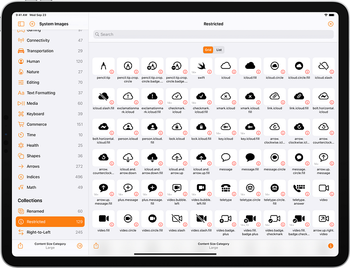
A red ⓘ button indicates a symbol is restricted. Tapping the button shows an alert explaining how the symbol can be used. Adaptivity also has a custom ‘Restricted’ collection which shows just the restricted symbols. The number of restricted symbols has increased in size from 59 in iOS 13 to 129 in iOS 14:
Renamed Symbols
Some 60 symbols have been renamed in iOS 14. For apps that support iOS 13, the older names must be used when actually running on iOS 13. When running on iOS 14, either name can be used. It’s probably simpler (i.e. no conditional code) to always use the old name. Apple have provided backward compatibility in iOS 14 and will, presumably, continue to do so in future iOS versions. If your app requires iOS 14 then I recommend using the new names.
There appears to be several different reasons for the renames:
- Naming and word order consistency E.g.
bin.xmarkis nowxmark.bin. - Differentiation with new symbols E.g.
dialis nowdial.minasdial.maxwas added. - Fixing spelling mistakes E.g.
ellipses.bubbleis nowellipsis.bubble. - Fixing incorrect names E.g.
square.stack.3d.down.dotted.lineis nowsquare.stack.3d.forward.dottedline— there's nothing "down" about the symbol. - More descriptive names E.g.
flip.horizontalis nowarrow.left.and.right.righttriangle.left.righttriangle.right.
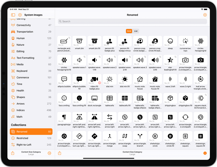
When the right sidebar is enabled, Apple’s SF Symbols Mac app shows availability information and, if applicable, the deprecated name for the selected symbol. In Adaptivity, when the “Show Availability” mode is enabled, a 14+,13 annotation indicates that a symbol was available in iOS 13 but has been renamed in iOS 14.
Adaptivity also has a custom ‘Renamed’ collection which shows all the symbols that have been renamed:
A long press on a symbol shows a much larger version in a context menu preview, along with the symbol name, availability, and the deprecated iOS 13 name. The List view also shows the availability and iOS 13 name:

The following is a complete list of the renamed symbols (I’m ignoring symbols that were added in iOS 14 and then renamed in a later beta):
Multicolor Symbols
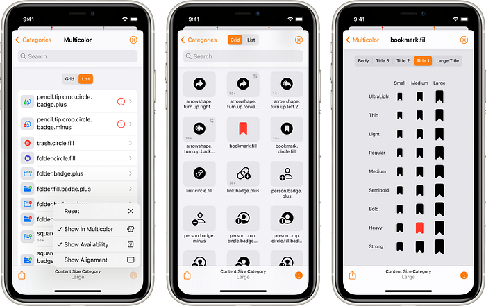
SF Symbols have always supported tinting. Apple made a big deal in their SF Symbols 2 announcement that some symbols now support multicolor. The GM release of SF Symbols v2.0 (build 40) removed 4 symbols and added 2 symbols to the Multicolor category. There are now 156 multicolor symbols, with a mixture of existing iOS 13 symbols and new iOS 14 symbols. Of course the multicolor feature only works in iOS 14 even for symbols that are available in iOS 13.
Adaptivity’s “Show in Multicolor” mode (selected from the Info icon in the bottom right) shows compatible symbols in multicolor. Unfortunately, even in the final iOS 14 release, the vast majority of them don’t display correctly at most scales or weights (but look ok in table view cells as can be seen in Adaptivity’s list view). There doesn’t seem to be a way to change the blue tint color used in some symbols. I would expect Adaptivity’s orange tint color to be used instead of the default iOS blue:
Localized Variants
Even in iOS 13, some symbols would appear horizontally flipped in right-to-left localizations. Some symbols (e.g. the goforward.10 etc. series of symbols) showed the numerals in Arabic or Devanagari.
When the right sidebar is enabled, Apple’s SF Symbols Mac app shows localization information for the selected symbol. In Adaptivity, a left-right arrow annotation (⇄) is shown on all symbols which have right-to-left localizations. There is also a custom ‘Right-to-Left’ collection to make them even easier to browse.
iOS 13 has 28 symbols which have right-to-left localizations:
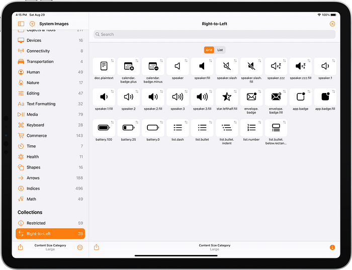
iOS 14 increases the number of symbols with right-to-left localizations to 245. There are more localized versions of existing iOS 13 symbols in addition to new iOS 14 symbols:

Some of the symbols with right-to-left localizations are separate symbols so that a non-right-to-left localized version is also available. Apple uses words such as “left” and “right” for symbols which are not right-to-left localized and words such as “leading”, “trailing”, “forward” and “backward” for symbols which are right-to-left localized. In the screenshot below the ⇄ annotation shows symbols with right-to-left localizations:

Adaptivity isn’t localized but it does have an option in its setting screen to force a right-to-left layout. This flips the entire user interface in the same way as the Right-to-left Pseudolanguage that can be configured in Xcode’s scheme settings when running your own app. Here’s the exact same symbols as above but shown in a forced right-to-left layout. The order in which the symbols are listed flips left-to-right (because the whole UI flips), but only the right-to-left localized symbols actually change appearance. For example, sidebar.left always has the sidebar on the left in all locales, but sidebar.leading shows the sidebar on the leading edge, which will be on the right in right-to-left locales:

Most right-to-left localized symbols completely flip along their horizontal axis, but some symbols only have parts of the image that flip. For example, in filemenu.and.cursorarrow and text.magnifyingglass the cursor and handle of the magnifying glass are always to the right but the lines of “text” in the image are flipped.
Bug Fixes
In iOS 13 there were a small number of symbols with “lefthalf” and “righthalf” in their name. The triangle and square left/right pairs had the wrong half of the image selected (right instead of left, and vice-versa):

I raised Feedback issue 6600230 for this on July 10th 2019 (early in the iOS 13 beta cycle), but the symbols were not fixed by the time iOS 13 was released. They have been fixed in iOS 14. If you were using the triangle/square left/right half symbols in your app, you had to use the opposite symbol name to work around the bug. You will need to change your code to use the correct symbol name when running on iOS 14 but keep using the opposite symbol name when running on iOS 13.
Changes During the iOS 14 Beta
To help developers keep up with changes during the beta cycle, Adaptivity had custom collections to show the changes in beta 2, 3, and 5. There were no changes in beta 4 or 6 through to the final release. At the time of writing, v2.0 of Apple’s SF Symbols Mac app is build 40 and includes the symbols as of the public release of iOS 14.
I removed these collections from the app when Apple released iOS 14 because it is no longer very useful to know what changed during the beta cycle. However, apps which use symbols added during the beta cycle will fail to load an image when run on earlier iOS 14 betas. Therefore, even though iOS 14 has been released you still might need to defensively code against some symbols failing to load to account for users who are still running early iOS 14 betas.
iOS 14 Beta 2
Amongst the changes in beta 2 were a lot of new arrow and chevron symbols with right-to-left localizations. star.lefthalf.fill was renamed as star.leadinghalf.fill (it was always right-to-left localized but now has a better name). The following two screenshots show all the changes in beta 2:


iOS 14 Beta 3
Beta 3 added new symbols including terminal, appclip, homepod.2, ladybug, and various sidebars. Some arrow symbols were renamed to list “left” before “right”:

iOS 14 Beta 5
Beta 5 brought more new symbols. There are now individual left/right airpod and airpodpro symbols, more speakers, shapes and heart symbols. Symbols containing the word “sheqel” were renamed to “shekel”:

Changes in SF Symbols v2.0 GM release
On September 23rd 2020, Mike Stern (Platform Experience and Design Evangelism Manager at Apple) tweeted that the GM version SF Symbols v2.0 was now available. This is build 40. The previously-available version, build 37, didn’t include symbol changes in iOS 14 beta 5. No symbols were changed in iOS 14 after beta 5.
In addition to supporting the final set of symbols in iOS 14, build 40 updated some of the categories to include more symbols. The biggest changes are 51 additional symbols in the ‘Objects & Tools’ category and 26 additional symbols in the ‘Arrows’ category. These are not new symbols (they were all in iOS 14 beta 5, perhaps earlier), but they have been added to the categories. A few other categories had small numbers of symbols added or removed.
The ‘Multicolor’ category had two symbols added: person.fill.badge.plus and person.fill.badge.minus. Four symbols were removed: externaldrive.fill.badge.plus, externaldrive.fill.badge.minus, externaldrive.fill.badge.checkmark, and externaldrive.fill.badge.xmark.
A new ‘Gaming’ category was added with 97 symbols. Again, these are not new symbols, they have just been brought together in a new category:

Resources
Apple
WWDC 2019: 206, Introducing SF Symbols
WWDC 2020: 10207, SF Symbols 2
iOS Human Interface Guidelines
Other Articles
SF Symbols in iOS 13 and SF Symbols: The benefits and how to use them guide by Antoine van der Lee.
What’s New in SF Symbols 2 by Zgeng.
Adaptivity
The screenshots in this article were taken either from a pre-release version of Adaptivity v7.0 (to show the changes in various iOS 14 betas) or the public v7.1. I closed the TestFlight beta after iOS 14 was released and v7.0 was released on the App Store. v7.1 has the same symbols as SF Symbols v2.0 (build 40) and was released on the App Store on 23rd September 2020.
Adaptivity is a tool for developers and designers to visualise the different screen sizes, layout margins, readable content guides, bar heights and Dynamic Type sizes that a modern, adaptive, iOS app uses when running on different devices and iPad multitasking sizes. There are also views for browsing System Colors, System Images and System Materials, and a view for exploring iPadOS 13.4’s Pointer Interactions. The app is a universal purchase and includes the Mac Catalyst version.
In addition to the improved SF Symbols support, version 7.0 added new views for exploring the double and triple column split view controller and a new iOS 14 widget.
Testimonials, more screenshots and information on all the features is available on my web site.
Other Articles That You Might Like
I have written articles on Bringing Adaptivity to Mac Catalyst, How to Switch Your iOS App and Scene Delegates for Improved Testing and the View Controller Presentation Changes in iOS 13.
I have also written about Working with Multiple Versions of Xcode and how to Hide Sensitive Information in the iOS App Switcher Snapshot Image.
If you found any of these articles helpful then please take a look at my apps in the iOS App Store to see if there’s anything that you’d like to download (especially the paid ones 😀).
If you work with a lot of Xcode projects you might like my Mac Menu Bar utility XcLauncher. It’s like having browser bookmarks for your favorite Xcode projects, workspaces, playgrounds, and Swift packages. There is more information on my website about XcLauncher’s features.
