SF Symbols Changes in iOS 14.5
Introduction
For a detailed list of symbols that were added or renamed in SF Symbols 2, please refer to my earlier article SF Symbols Changes in iOS 14.0. For changes in iOS 14.2 see SF Symbols Changes in iOS 14.2.
iOS 14.5 was released on 26th April 2021 after a long beta period. Beta 3 added some new symbols and renamed a few. No changes were made after beta 3.
There are now four different sets of symbols to consider:
- SF Symbols v1.1 available in iOS/iPadOS/tvOS/Mac Catalyst 13.0, watchOS 6.0 and macOS 11.0
- SF Symbols v2.0 available in iOS/iPadOS/tvOS/Mac Catalyst 14.0, watchOS 7.0 and macOS 11.0
- SF Symbols v2.1 available in iOS/iPadOS/tvOS/Mac Catalyst 14.2, watchOS 7.1 and macOS 11.0
- SF Symbols v2.2 (expected version number) available in iOS/iPadOS/tvOS/Mac Catalyst 14.5, watchOS 7.4 and macOS 11.3
An app can only use symbol names that are supported by the OS version it is running on. Symbols that were renamed are still available using their earlier names for backwards compatibility. However, Jiang Jiang (who appears to work at Apple) mentioned on Twitter that:
It is worth noticing that while aliased (old) names continue to work it is definitely better to migrate to the up-to-date names for performance reasons.
The minimum iOS deployment version for your app will determine which symbols you can use and whether you must keep using the older names (or use runtime availability checks to use the new names on later versions).
What are the Changes in iOS 14.5?
I’m writing this article before Apple have updated their SF Symbols app or its release notes. The symbol changes in iOS 14.5 are relatively minor.
My own Adaptivity app is a tool for iOS developers and designers, and one of its many features is a view to browse SF Symbols. As long as your device is running an OS that supports them, you can choose whether to browse the symbols available in iOS 13, 14.0, 14.2 or, in an upcoming release, 14.5. This can be incredibly useful because it limits the symbols to only those available in that iOS version. It also shows the names that were used in that iOS version.
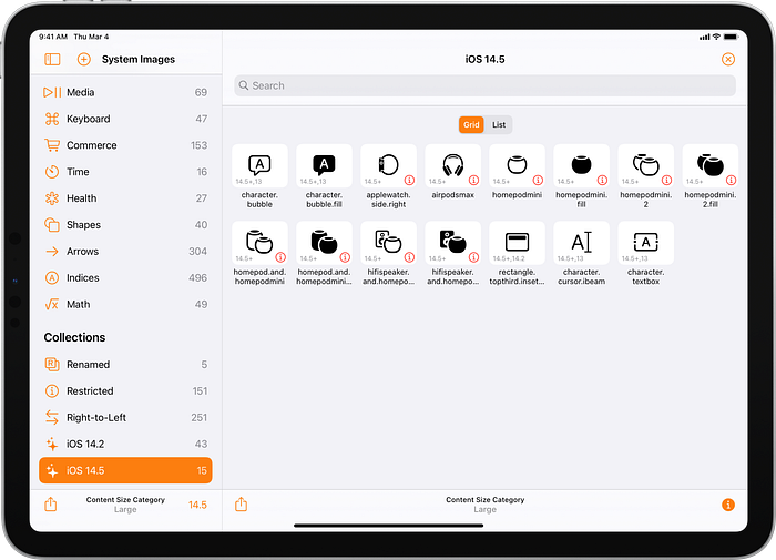
When the iOS 14.5 symbols are selected, Adaptivity shows the changes for iOS 14.0, 14.2 and iOS 14.5 in its What’s New category. A separate iOS 14.5collection shows the new and renamed symbols in iOS 14.5:

New Symbols
The 10 symbols in the screenshot annotated with 14.5+ are completely new in iOS 14.5:
applewatch.side.right
airpodsmax
homepodmini
homepodmini.fill
homepodmini.2
homepodmini.2.fill
homepod.and.homepodmini
homepod.and.homepodmini.fill
hifispeaker.and.homepodmini
hifispeaker.and.homepodmini.fill
Renamed Symbols
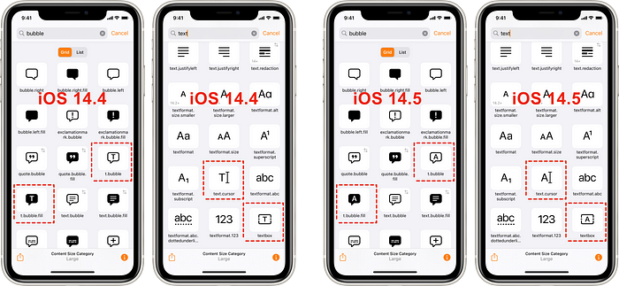
character.bubble and character.bubble.fill are new names in iOS 14.5 but the symbols were added in iOS 13 (as indicated by Adaptivity’s 14.5+,13 annotation) under different names: t.bubble and t.bubble.fill. These symbols were presumably renamed because they have Arabic and Hebrew localisations (which Adaptivity does not currently show).
When rectangle.topthird.inset was added in iOS 14.2 I noted that it was missing the .fill suffix that was found on related existing symbols. That’s now been changed (as indicated by Adaptivity’s 14.5+,14.2 annotation).
character.cursor.ibeam is a new name in iOS 14.5 but has been available since iOS 13 (as indicated by Adaptivity’s 14.5+,13 annotation) under a different name: text.cursor. Similarly,character.textbox is a new name in iOS 14.5 but has been available since iOS 13 under a different name: textbox. These symbols already had several localizations in other languages.
Redesigned Symbols
In addition to being renamed, the character.bubble, character.bubble.fill, character.cursor.ibeam and character.textbox symbols have changed appearance in iOS 14.5. This is true even for apps that refer to the old names (which are just aliases) and for apps built with an Xcode version earlier than 12.5. There is no backwards compatibility for the actual appearance of symbols. If you use t.bubble, t.bubble.fill, text.cursor or textbox in your app, the appearance will be different in iOS 14.5. The change from using “T” to “A” appears to be for consistency with many other text-related symbols.

Duraid Abdul mentioned on a Twitter that the air quality images changed appearance in iOS 14.5 beta 2. Again, these new images will be used as soon as an app using them is run on iOS 14.5.

Restricted Symbols
As indicated by the red ⓘ button, the 10 new symbols are all restricted and can only be used to refer to their corresponding Apple devices (Apple Watch, Airpods Max and HomePod mini).
The symbol pencil.top.crop.circle.badge.arrow.forward was added in iOS 14 but is now marked as restricted to Apple’s Markup feature. This fixes an inconsistency with other symbols with pencil.tip in their names that were already restricted.
Other Changes
I am not aware of any changes to multicolor symbols or right-to-left localizations symbols in iOS 14.5. It’s hard to be sure without the upcoming SF Symbols v2.2. I will update this article when that is released.
It seems highly likely that the 10 new symbols will be added to the Devices category alongside other Apple Watch, Airpods and Homepod symbols.
Resources
Apple
WWDC 2019: 206, Introducing SF Symbols
WWDC 2020: 10207, SF Symbols 2
iOS Human Interface Guidelines
Other Articles
SF Symbols Changes in iOS 14.2
SF Symbols in iOS 13 and SF Symbols: The benefits and how to use them guide by Antoine van der Lee
What’s New in SF Symbols 2 by Zgeng
Adaptivity
The screenshots in this article were taken from Adaptivity v7.7. The app has some features which can make it more useful than SF Symbols for browsing the symbols:
- runs on your phone, iPad and Mac
- limit the view to only include symbols that are available in a specific iOS version (13, 14.0, 14.2 or 14.5), displaying names that are appropriate for that version (which also work on later versions)
- optionally show a small annotation alongside each symbol to indicate if a symbol was added after iOS 13 or if it has been renamed (or both)
- optionally show image alignment and baseline information
- view a symbol at different scales and weights for a range of dynamic type sizes
- long pressing an image shows a larger version and information on right-to-left localisation, multicolor support, iOS version availability and older names (if applicable)

- custom collections to highlight symbols that have been renamed, are restricted, or have right-to-left localizations
- supports multiple windows on iPad and Mac so that, for example, you can browse two different symbol sets at the same time and compare between them
Adaptivity has many other features. It is primarily a tool to visualize the different screen sizes, layout margins, readable content guides, bar heights and Dynamic Type sizes that a modern, adaptive, iOS app uses when running on different devices and iPad multitasking sizes. There are also views for browsing System Colors, System Fonts and System Materials, and a view for exploring iPadOS Pointer Interactions. The app is a universal purchase and includes the Mac Catalyst version. On macOS 11 this is “optimised for Mac” with native controls and does not scale content. If you are an iOS developer or designer, I’m sure you will find Adaptivity very useful. Testimonials, more screenshots and information on all the features is available on my web site.
Other Articles That You Might Like
I have written articles on How iOS Apps Adapt to the various iPhone 12 Screen Sizes, Bringing Adaptivity to Mac Catalyst, How to Switch Your iOS App and Scene Delegates for Improved Testing and the View Controller Presentation Changes in iOS 13.
I have also written about Working with Multiple Versions of Xcode and how to Hide Sensitive Information in the iOS App Switcher Snapshot Image.
If you found any of these articles helpful then please take a look at my apps in the iOS App Store to see if there’s anything that you’d like to download (especially the paid ones 😀).
If you work with a lot of Xcode projects you might like my Mac Menu Bar utility XcLauncher. It’s like having browser bookmarks for your favorite Xcode projects, workspaces, playgrounds, and Swift packages. There is more information on my website about XcLauncher’s features.
