View Controller Presentation Changes in iOS and iPadOS 16
Introduction
At the time of writing (14th August 2022), iOS and iPadOS 16.0 are still in beta with the most recent release being beta 5. Beta 6 was released on 15th August 2022. Other than introducing new device sizes, there have been relatively few changes in view controller presentations since the iOS/iPadOS 13.0 introduced the non-full-screen sheet modal presentation appearance and the default presentation mode changed to page sheet. My article from 2019 has all the details: View Controller Presentation Changes in iOS 13.
iOS 15 brought custom sheet presentations to UIKit and iOS 16.0 increased their flexibility with custom detent sizes. iOS 16.0 brings these to SwiftUI.
In iOS/iPadOS 16.0 there have been a few minor and one significant change in behaviour when presenting modal view controllers:
- when the presenting view controller is in a regular-width environment on iPad, form sheets are slightly bigger than on previous iPadOS versions. This changed in beta 4. (If the presenting view has compact width, a form sheet presentation will adapt and fill the width, just like on iPhone.)
- the height of the navigation bar in a non-full-screen, non-popover, modally-presented view controller is smaller than before (12 points smaller on iPhone and 6 points smaller on iPad). This change occurred in beta 5. Many thanks to Jordan Hipwell for discovering this and bringing it to my attention. He also discovered this has not (yet?) changed in SwiftUI. Edit: and it was just reverted in beta 6 🤦♂️
- non-full-screen modally-presented double and triple column style split view controllers have a different appearance compared to iPadOS 13 to 15.
Apple have (had?) a good track record of providing backward-compatibility for apps built with earlier Xcode versions (i.e. linked against an earlier iOS version). Apps usually have to be rebuilt with the latest tools (i.e. linked against the latest iOS version) before they adopt new behaviours. Some of the changes discussed in this article only take affect after rebuilding, however others do not. Existing apps, already live in the App Store, will behave differently when run on iOS/iPadOS 16.0 in certain circumstances.
We have learned that our apps should be flexible, use layout margins and safe areas, respond to changes in Content Size Category (also known as Dynamic Type), and fit content to whatever size they happen to find themselves in.
That said, I think the way iPadOS 16 tries to provide backward compatibility when an Xcode 13 build of an app uses a default presentation of a double or triple column split view controller has a bug. It correctly fills the full width (matching earlier behaviour), but the width of the primary view controller is 80 points narrower. This issue and a workaround is discussed in more detail later.
Adaptivity
Most of the screenshots in this article were taken from the iOS/iPadOS 15.6 and 16.0 beta 5 simulators running my Adaptivity app. It is primarily a tool to visualize the different window sizes, layout margins, readable content guides, bar heights and Dynamic Type sizes that a modern, adaptive, iOS app uses when running on different devices and iPad multitasking sizes. This makes it the perfect tool to investigate and easily see the changes to appearance and behaviour in iPadOS 16.0. The layout views are also a great way to see how Stage Manager behaves and how apps transition between the different fixed sizes when resized and, when crossing a threshold, flip between compact- and regular-width size classes.
The app also includes views for browsing System Colors, System Images (SF Symbols), System Materials, System Fonts and more. Full information on all of Adaptivity’s features is available on my web site.
Form Sheet Presentations
Prior to iPadOS 16.0, form sheets were 540×620 points in size:
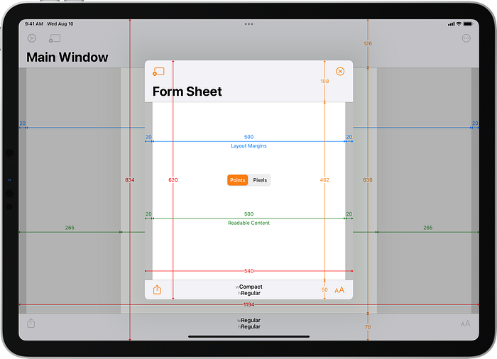
In iPadOS 16.0 beta 4, form sheets increased in size to 580×640 points. This change occurs even when running an Xcode 13.4 (iOS 15) build. It is not necessary to rebuild with Xcode 14 to see this change:

Navigation Bar Heights
The changes described in this section were correct for iOS 16.0 beta 5 but it appears that beta 6 has reverted back to the old behaviour! Unfortunately there’s not a corresponding new Xcode 14 beta and new simulators so I cannot make new screenshots yet.
I will leave this section here for now but will remove it when I can make my updates.
iPad
The screenshots above of a form sheet presentation also show that the navigation bar has reduced in height by 6 points in iPadOS 16.0. This change occurred in beta 5 and, again, does not require building with Xcode 14. A similar reduction in navigation bar height occurs when using a compact navigation bar (56 points prior to iPadOS 16.0 beta 5; 50 points on beta 5):


The same 6 point reduction in height occurs for page sheet presentations. The size of the page sheet itself has not changed:
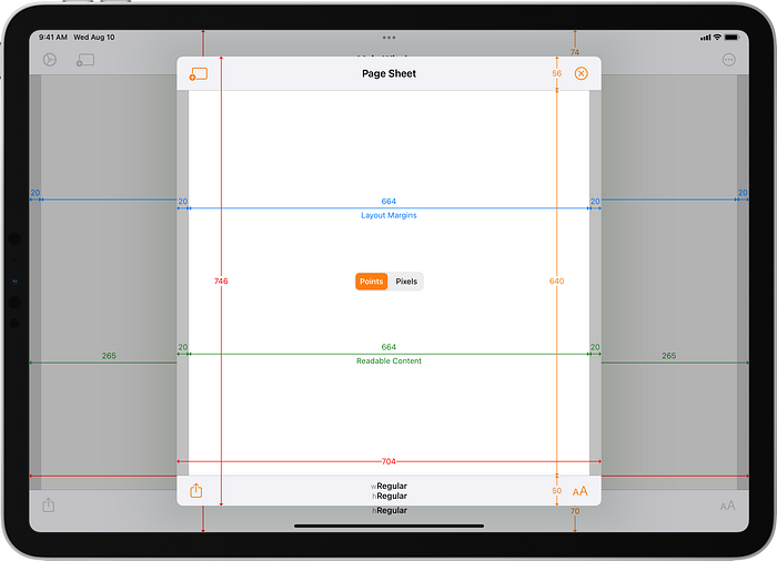
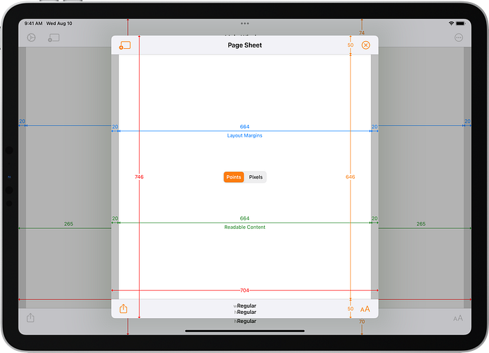
Note that since iPadOS 13, the width of page sheets varies with changes to the Content Size Category (also known as the Dynamic Type size). The screenshots in this article all use the default (Large) content size category.
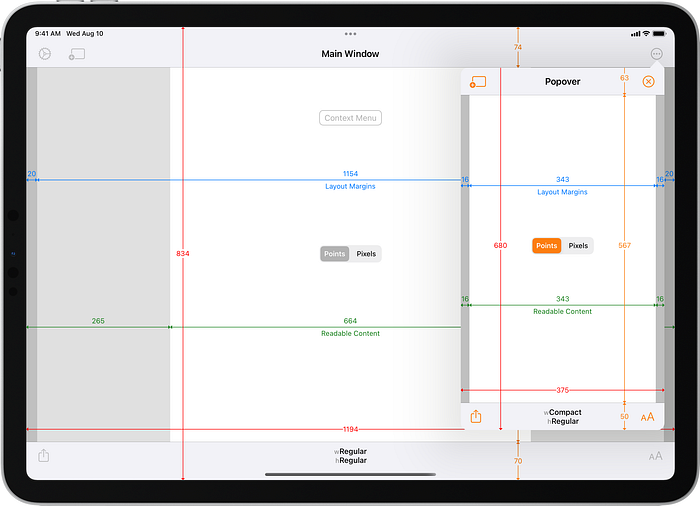
Popovers, however, are unchanged (with one very minor difference I will discuss later). The navigation bar in a popover with a compact title is 63 points tall (it extends from the top of the arrow to the bottom of the bar), but that bar’s visible size is mostly clipped beneath the arrow. The visible height was already 50 points prior to iPadOS 16.0:
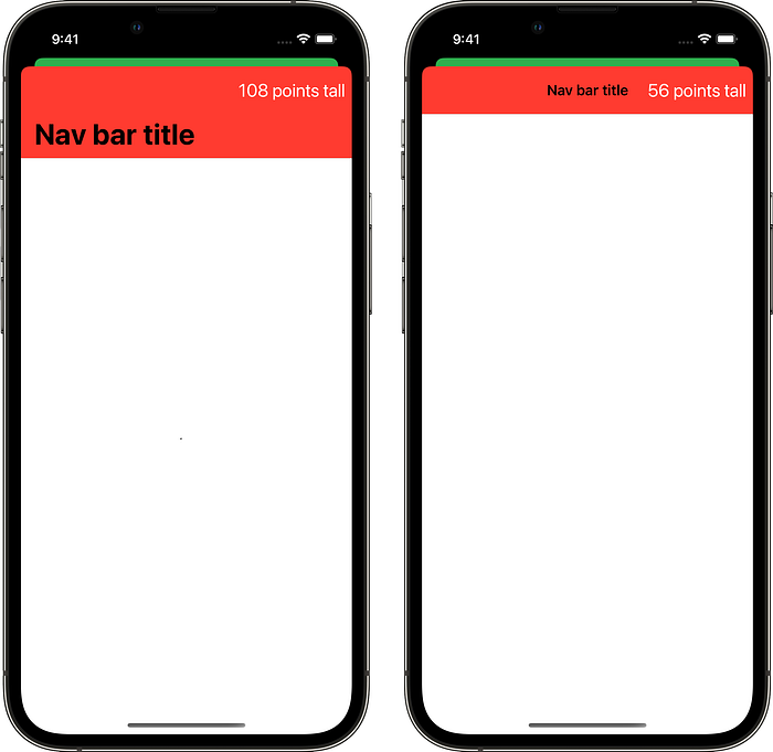
With a SwiftUI app, however, iPadOS 16.0 beta 5 continues to use the same navigation bar heights in non-full-screen presentations as a UIKit app does prior to iPadOS 16.0 beta 5. This is even the case when the SwiftUI app is built with Xcode 14 beta 5. In a non-full-screen presentation, a large navigation bar is 108 points tall and a compact navigation bar is 56 points tall:


iPhone
On iPhone, the navigation bar height in a non-full-screen presentation has reduced in height by 12 points in iOS 16.0 beta 5 (from 108 points to 96 points). This change occurs even when running an Xcode 13.4 (iOS 15) build:

A similar reduction in navigation bar height occurs when using a compact navigation bar (56 points prior to iPadOS 16.0 beta 5; 44 points on beta 5):

Just like on iPad, a SwiftUI app on iPhone running iOS 16.0 beta 5 continues to use the same navigation bar heights in non-full-screen presentations as a UIKit app does prior to iOS 16.0 beta 5. A large navigation bar is 108 points tall and a compact navigation bar is 56 points tall:
Split View Controller
UISplitViewController is very powerful and flexible and became even more so in iOS/iPadOS 14 with the introduction of double/triple column styles and the ability to use a custom view controller in compact-width environments (as an alternative to collapsing the view controllers into a single navigation stack). There are many properties for configuring the appearance and behaviour of split view controllers. I want to focus on default configurations in this article to highlight how the behaviour has changed in iPadOS 16.0.
Prior to iPadOS 13.0, split view controllers could only be used full screen, either as the root view controller in a window or with a full screen modal presentation. The introduction of card-like sheet presentations in iPadOS 13.0 enabled support for form sheet and page sheet presentations of split view controllers. That version also introduced an automatic modal presentation style and made that the default. Part of the header file documentation for modalPresentationStyle states (emphasis added):
By default UIViewController resolves UIModalPresentationAutomatic to UIModalPresentationPageSheet, but system-provided subclasses may resolve UIModalPresentationAutomatic to other concrete presentation styles. Participation in the resolution of UIModalPresentationAutomatic is reserved for system-provided view controllers.
To my knowledge, UISplitViewController is the only view controller whose appearance with theautomatic modal presentation style is different to pageSheet. It adapts to fill the width of the presenting view controller.
I think it is fair to say that presenting a split view controller non-full-screen is uncommon, but it has been possible since iOS/iPadOS 13.0. How it appears depends on the iPadOS version and, with the introduction of changes in iPadOS 16.0, whether the app has been rebuilt with Xcode 14 or not.
Classic Style
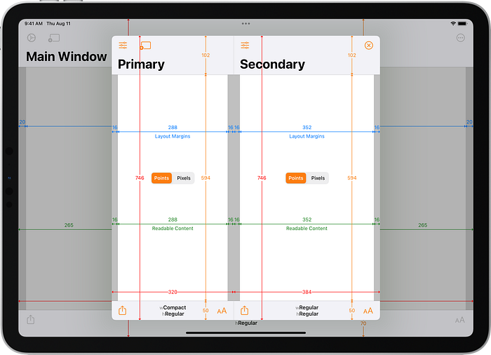
The classic style of split view controller was introduced in iOS 3.2. On iPad, with default configuration, a full-screen classic style split view controller shows both primary and secondary view controllers in landscape. The width of the primary view varies with the device size but is either 320 or 375 points, with the secondary view controller filling whatever width remains:

Since this is a full screen presentation, the change to navigation bar heights seen in iOS and iPadOS 16.0 in beta 5 does not occur and a full screen classic style split view controller on iPadOS 16.0 looks identical to earlier versions.
As noted above, since iPadOS 13.0 it has been possible to present split view controllers with non-full-screen modal presentation styles. The default presentation of a classic style split view controller adapts to fill the width and has the now familiar card-like sheet appearance where the height falls short of the full height of the screen and the presenting view controller remains partially visible and recedes behind it:

On iPadOS 16.0, the default presentation of a classic style split view controller is unchanged other than the reduction in height of the navigation bars in beta 5. The adaption to full width continues to happen for the classic style no matter which version of Xcode the app is built with:

When presented as a form sheet, the classic style split view controller is 540×620 points in size prior to iPadOS 16.0 beta 4. This is compact width and only the primary view controller is visible. Showing the secondary view controller requires it to be pushed onto the navigation stack. In Adaptivity, this is achieved by tapping the “Secondary” button that is shown in the primary view controller when the split view controller is compact width.

On iPadOS 16.0, a classic style split view controller presented as a form sheet has the increased 580×640 points size since beta 4 and the reduced navigation bar height seen earlier in beta 5. These changes occur even when running an Xcode 13.4 (iOS 15) build:

When presented as a page sheet, the appearance of the classic style split view controller depends on the device size and Content Size Category (Dynamic Type size). Since iPadOS 13.0, page sheets get wider at larger content sizes and that can result in changes to the width of the primary view controller (320 or 375 points) and whether the secondary view controller is also shown. On the 11" iPad Pro, with default settings, both view controllers are shown at widths of 320 and 384 points respectively. As with all page sheet presentations, the height depends on the height (and orientation) of the device.

On iPadOS 16.0 beta 5, the size of a classic style split view controller in a page sheet is unchanged but the navigation bars are reduced in height by 6 points:
Split view controllers can even be presented in popovers. By default, a popover presentation will adapt to an automatic presentation in a compact width environment. Popevers are compact width and show just the primary view controller by default. In Adaptivity, popovers for view controllers other than the generic “Modal View Controller” view have a preferred content size of 375 points wide and 2000 points tall. The width can be honoured, but the height must be reduced to fit the available space.

On iPadOS 16.0, a popover presentation of a classic style split view controller reveals a minor change in behaviour introduced in beta 4, but only for apps built with Xcode 14. Remember that Adaptivity is requesting a preferred content size larger than the available height. Adaptivity does not set the popover presentation controller’s permittedArrowDirections property. Earlier iPadOS versions (and Xcode 13 builds run on iPadOS 16.0) present the popover with an upwards arrow, whereas Xcode 14 builds since beta 4 present it with a rightwards arrow. This only happens when the preferred content size height is too large. I presume that iPadOS is switching to a rightwards arrow so that the popover can be slightly taller and more closely match the preferred content size (i.e. the reduction in height is smaller):

Similar to how the navigation bar in a popover was 13 points taller than its visible height in order to account for the upwards arrow, with a rightwards arrow the view controller is 13 points wider than its 375 points visible size at 388 points.
Note, however, that the trailing margin has not been increased to account for this and both the primary and secondary view controllers (when pushed on the navigation stack) have layout margins and readable content guides which are 13 points wider than they should be. Content aligned with a trailing layout guide will be too close to the visible edge of the popover when the arrow points to the right. I did not test it, but I assume the reverse would happen if the arrow pointed to the left.
This might be a longstanding issue when using horizontal arrows for popovers. I didn’t want to get too distracted by this, but I did notice that the trailing safe area layout guide margin is increased by 13 points to account for a rightwards arrow. Some types of view controllers are not increasing their trailing layout guide and readable content margins in response to the change in safe area margins.
Double Column Style
The double column style introduced in iOS/iPadOS 14.0 appears similar to the classic style in its default configuration, but has some subtle differences.
Whilst the width of the primary view controller in a full screen or default presentation of the classic style split view controller was either 320 points or 375 points (depending upon the device size), a double column style always has a visible width of 320 points prior to iPadOS 16.0.
I say “visible width” because the view controller is actually 420 points wide but its leading 100 points are off the edge of the screen. This is because it is possible to swipe the primary view controller to the right (in a left-to-right language), partially revealing the off-screen content. The leading layout margin is increased by 100 points (116 instead of 16) to counteract this so that content aligned with the margins continues to appear visible. I made a few tweets and screenshots back in July 2020 which try to explain this.

Since this is a full screen presentation, the change to navigation bar heights seen in iOS and iPadOS 16.0 beta 5 does not occur and a full screen double column style split view controller on iPadOS 16 looks identical to earlier versions.
Prior to iPadOS 16.0, the default presentation of a double column style split view controller adapts to fill the width and has the familiar card-like sheet appearance. As with a full screen presentation, the primary view controller has a fixed visible width of 320 points (actual width 420 points to allow for over-swiping):

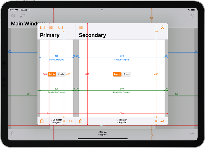
On iPadOS 16.0 things get interesting. An Xcode 13 build presenting a double column style split view controller with the default presentation style continues to adapt to the full width, has a reduced navigation bar height (in beta 5), but also has a reduced primary view controller width (visible 240 points, actually 340 points due to the 100 points off screen):

I think this is a bug (reported as part of FB10586694). As will become very clear in a moment, iPadOS 16.0 is providing backward compatibility for Xcode-13-built apps with the default presentation style by adapting to fill the width, but it is not keeping the primary view controller at a visible width of 320 points.
On iPadOS 16.0, an Xcode 14 build presenting a double column style split view controller with the default presentation style no longer adapts to full width. The secondary view controller is shown at the same size as a form sheet presentation (580×640 points since beta 4) with a 240 points visible width for the primary view controller (actually 340 points due to the 100 points off screen):
This changes two years of precedented behaviour (three if you include the full-width adaption for a default presentation of a classic style split view controller introduced in iPadOS 13). In a comment on my feedback report about this change, Apple said:
The new layouts for the UISplitViewController in the sheet presentations are new design for iOS 16.0 and are expected.
I think this new behaviour explains the 240 points wide primary view controller when iPadOS 16.0 is attempting to provide backward compatibility for apps built with Xcode 13 (i.e. linked against iOS 15).
When presented as a form sheet, prior to iPadOS 16.0, the double column style split view controller looks just like the classic style and is 540×620 points in size:

Since iPadOS 16.0 beta 4, a double column style split view controller presented as a form sheet by an app built with Xcode 13 has the increased 580×640 points size. It also has a reduced navigation bar height in beta 5:

Build with Xcode 14 and the new behaviour is seen. A double column style split view controller presented as a form sheet looks identical to the default presentation:

When presented as a page sheet, prior to iPadOS 16.0, the double column style split view controller has the same size as the classic style but, with default configuration, only shows the secondary view controller:

Tapping the “Primary” back button causes the primary view controller to slide on top of the secondary view controller:

This appearance and behaviour can be configured using the preferredDisplayMode and preferredSplitBehaviour properties.
Other than the reduction in height of the navigation bars in beta 5, an Xcode-13-built app running on iPadOS 16.0 looks and behaves the same as earlier iOS versions with a form sheet presentation.
Build with Xcode 14 and, once again, the new behaviour is seen. A double column style split view controller presented as a page sheet has the usual 704×746 points total size for an 11" iPad Pro but both primary and secondary view controllers are visible (with default configuration):

Like other page sheet presentations, its width varies with changes to the Content Size Category. When both view controllers are visible, the primary remains at a visible width of 240 points and the secondary view controller varies its width.
This appearance is unusual in that a page sheet presentation is narrower than a form sheet presentation. That has never happened before: page sheets have always been at least as wide as form sheets (they will be the same width in compact width environments where they fill the width of the presenting view controller).
Prior to iPadOS 16.0 beta 4, a popover presentation of a double column style split view controller looks the same as the classic style:

An Xcode 14 build of Adaptivity run on iPadOS 16.0 beta 4 or later uses a rightwards arrow because Adaptivity is requesting a preferred content size that is too tall to fit. Unlike with the classic style view controller, the trailing layout margins are increased in size by 13 points to account for the extra width that the popover occupies due to the rightwards arrow:

Triple Column Style
The triple column style introduced in iOS/iPadOS 14 has primary, supplementary and secondary view controllers. There are many properties to configure its appearance and behaviour, but I will focus on default behaviour.
By default, a triple column style split view controller always seems to use a width of 375 for the supplementary view controller for all iPadOS versions, presentation styles and device sizes. The width of the primary view controller, however, depends on the presentation style and iPadOS version. The secondary view controller fills whatever width remains.
A full screen triple column split view controller shows the supplementary and secondary view controllers:

Tapping the back button in the supplementary view controller reveals the primary view and, with default configuration, pushes both the supplementary and secondary view controllers to the right with the secondary view dimmed and partially off the right of the screen. The primary view controller has a visible width of 320 points with an extra 100 points off screen for over-swiping:

Since this is a full screen presentation, the change to navigation bar heights seen in iOS and iPadOS 16.0 beta 5 does not occur and a full screen triple column style split view controller on iPadOS 16 looks almost identical to earlier versions. There is a tiny difference: the button in the supplementary view which reveals the primary view uses the sidebar icon on iPadOS 16.0 and not a back chevron:
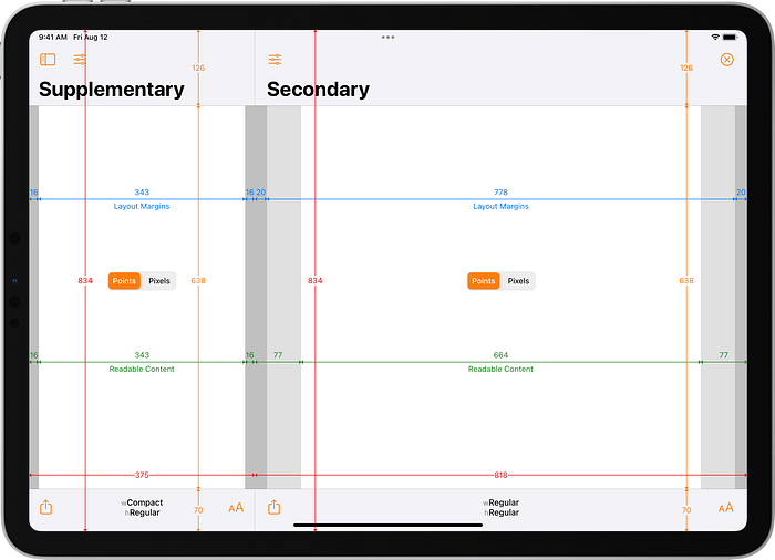
Prior to iPadOS 16.0, the default presentation of a triple column style split view controller adapts to fill the width and has the familiar card-like sheet appearance. As with a full screen presentation, the supplementary view controller has a fixed width of 375 points and a back button reveals the primary view controller (not shown):

As with the double column style, on iPadOS 16.0 the behaviour changes. An Xcode 13 build presenting a triple column style split view controller with the default presentation style continues to adapt to the full width, has a reduced navigation bar height in beta 5 and the supplementary view shows a sidebar icon for revealing the primary view:

When the primary view controller is revealed, with default configuration, it pushes both the supplementary and secondary view controllers to the right with the secondary view dimmed and partially off the right of the screen. The primary view controller has a visible width of 240 points with an extra 100 points off screen for over-swiping. As with a default presentation of the double column style split view controller in an Xcode 13 build, this is 80 points narrower than a full screen view:

Once again, I claim this is a bug. If iPadOS 16.0 is going to adapt the default presentation to full width for an Xcode 13 built app then it should also keep the primary view controller with a visible width of 320 points.
On iPadOS 16.0, an Xcode 14 build presenting a triple column style split view controller with the default presentation style no longer adapts to full width. This is shown at the same height as a form sheet (640 points since beta 4) with a fixed 375 points wide supplementary view controller and a secondary view controller that is 524 points wide:
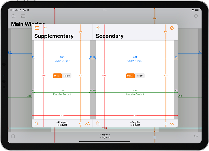
Tapping the sidebar button in the supplementary view controller reveals the primary view controller with a visible width of 240 points (plus 100 points off screen for over-swiping even though it’s not possible to swipe the primary view unless the split view controller fills the width of the screen). With default configuration, the secondary view dims and is cropped:

When presented as a form sheet, prior to iPadOS 16.0, the triple column style split view controller looks just like the classic and double column style and is 540×620 points in size:

Since iPadOS 16.0 beta 4, a triple column style split view controller presented as a form sheet by an app built with Xcode 13 has the increased 580×640 points size. It will also have a reduced navigation bar height in beta 5:

Build with Xcode 14 and the new behaviour is seen. A triple column style split view controller presented as a form sheet looks and behaves identical to the default presentation:

When presented as a page sheet, prior to iPadOS 16.0, the triple column style split view controller has the same size as the classic and double column styles but, with default configuration, like the double column style it only shows the secondary view controller:

Tapping the “Supplementary” back button in the secondary view controller causes the supplementary view controller to slide on top of the secondary view controller:

Tapping the back button in the supplementary view controller causes the primary view controller to slide in, pushing the supplementary view controller to the right:

This appearance and behaviour can be configured using the preferredDisplayMode and preferredSplitBehaviour properties.
Other than the reduction in heights of the navigation bar in beta 5, an Xcode-13-built app running on iPadOS 16.0 looks and behaves the same as earlier iOS versions with a page sheet presentation.
Build with Xcode 14 and, once again, the new behaviour is seen. A triple column style split view controller presented as a page sheet has the same 704×746 points total size for an 11" iPad Pro but both supplementary and secondary view controllers are visible (with default configuration):

Tapping the sidebar button in the supplementary view controller reveals the primary view controller and, with default configuration, pushes both the supplementary and secondary view controllers to the right with the secondary view dimmed and partially off the right of the page sheet. The primary view controller has a visible width of 320 points with an extra 100 points off screen for over-scrolling:

Like other page sheet presentations, its width varies with changes to the Content Size Category. The primary and supplementary view controllers are always fixed in width and the secondary view controller varies its width.
Like the double column style split view controller, the triple column style with a page sheet presentation is narrower than with a form sheet presentation.
A popover presentation of a triple column style split view controller behaves much the same as with a double column style except that there are three levels of view controllers that can be pushed on the navigation stack.
Summary
Here’s a summary of the view controller presentation changes in iOS/iPadOS 16:
- form sheets got slightly bigger since iPadOS 16.0 beta 4
- navigation bar heights in non-full-screen (and non-popover) modal presentations got slightly smaller in iPadOS 16.0 beta 5 for UIKit apps, but not SwiftUI apps. This change was reverted in beta 6
- since iPadOS 16.0 beta 4, popover presentations will use a horizontal arrow rather than a vertical arrow if there’s not enough height to respect the popover’s preferred content size
- in iPadOS 16, with an Xcode 13 build, the default presentation of double and triple column view controllers has a bug. It correctly adapts them to fill the width as in iPadOS 13 to 15 but it incorrectly reduces the width of the primary view controller by 80 points
- in iPadOS 16, with an Xcode 14 build, the default presentation of double and triple column split view controllers resolve to form sheet (and not to page sheet, which happens for all other types of view controller)
- in iPadOS 16, with an Xcode 14 build, the appearance and behaviour of form and page sheet presentations of double and triple column split view controllers has changed significantly
Workarounds to Keep Previous Behaviour
Form Sheet Size
I don’t think it should be necessary to keep the previous form sheet size on iPadOS 16.0 beta 4 and later. Apps ought to be flexible enough to adapt to minor changes in appearance. If you really must keep the 540×620 points size, setting the preferredContentSize for the presented view controller achieves this:
vcToBePresented.preferredContentSize = CGSize(width: 540,
                                              height: 620)
Primary View Controller Width Reduction
To work around the reduction in width of the primary view controller when an Xcode 13-built app presents a double or triple column split view controller with a default modal presentation style on iPadOS 16.0, explicitly request a width of 320 points:
splitViewController.maximumPrimaryColumnWidth = 320
splitViewController.preferredPrimaryColumnWidth = 320
I am hoping this bug will be fixed before iPadOS 16.0 is released. This workaround will no longer be required, but won’t cause problems, if it is fixed.
Full Width Split View Controller Adaptions
To keep the adaption to full width for the default presentation of double and triple column split view controllers in iPadOS 16.0, set a ridiculously-large preferredContentSize on the split view controller. This will cause it to be as wide and tall as possible. The width will be limited by the size of the screen and the height will be limited by the card-like appearance of sheet presentations:
splitViewController.preferredContentSize = CGSize(width: 100000,
                                                  height: 100000)
If you want to keep the full width appearance, it is likely that you would also want to keep the primary view controller with a visible width of 320 points. Setting the maximum and preferred primary column width properties as described above will achieve that.
Why did Split View Controller Presentations Change?
Photo Picker
We may never know for sure, but I strongly suspect the change to how double and triple column split view controllers are presented in iPadOS 16.0 is to support the new design for the system photo picker, PHPickerViewController. The older UIImagePickerController still works just fine and uses the newer appearance on iOS/iPadOS 14.0 and later (with some minor differences on iPadOS 16.0 described below).
In iPadOS 14 to 15, the system photo picker (old or new) appeared to be a single view controller. With a default presentation it has the page sheet size of 704×746 points (since default presentations resolve to page sheet):

On iPadOS 16.0, the photo picker now appears to be a double column split view controller. Thanks to Justin Jia on Twitter who clarified some behaviour for me.
The older UIImagePickerViewController with a default presentation resolves to a page sheet size on iPadOS 16.0 (no matter which Xcode version was used to build the app). The primary view controller has a visible width of 240 points:

The newer PHPickerViewController with a default presentation resolves to a form sheet on iPadOS 16.0 (no matter which Xcode version was used to build the app):

We can explicitly request a form sheet presentation for the older UIImagePickerController and get the wider but shorter appearance seen with PHPickerViewController:

Similarly, we can explicitly request a page sheet presentation for the newer PHPickerViewController and get the taller but narrower appearance seen with UIImagePickerController:
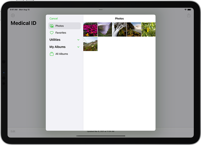
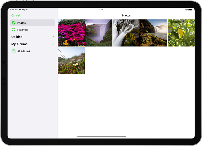
We can also explicitly request a full screen presentation for the photo picker. With both UIImagePickerController and PHPickerViewController this results in the primary view controller having a visible width of 320 points:
Document Picker
Justin Jia’s tweet also mentioned the document picker. For completion, here’s what happens with UIDocumentPickerViewController.
Since iPadOS 14, the document picker appears to be a double column split view controller. In iPadOS 14 to 15, with a default presentation, it resolves to page sheet. The primary view controller is hidden by default and it overlays the secondary view controller when revealed. It has a width of 320 points:

UIDocumentPickerViewController on 11" iPad Pro running iPadOS 15.5A default presentation resolves to a form sheet on iPadOS 16.0 (no matter which Xcode version was used to build the app). The primary view controller is always visible and has a visible width of 240 points:

Possible Better Behaviour
We have seen that the default presentation of a double or triple column split view controller resolves to a form sheet on iPadOS 16.0. PHPickerViewController also resolves to a form sheet by default. UIImagePickerController, however, is overriding the default behaviour and resolving to a page sheet.
Maybe I’m missing some important context, but given this new behaviour in the photo picker, it seems it would have been a lot less disruptive if the default presentation of double and triple column presentation continued to adapt to fill the width and had a card-like sheet appearance in iPadOS 16.0. The photo picker could continue to explicitly choose its page sheet (UIImagePickerController) of form sheeet (PHPickerViewController) presentation and look exactly the same as it does now.
Explicitly requesting a form sheet presentation for double and triple column style split view controllers would give the appearance that iPadOS 16.0 currently shows for default presentations. There would be no loss of functionality compared with iPadOS 16.0’s current behaviour but there would be fewer changes in appearance when building with Xcode 14. Of course, the bug where the primary view controller is 80 points narrower when adapting to full width would still need to be fixed.
Other Articles That You Might Like
I have written a whole series of articles explaining the changes that have occurred to SF Symbols since their introduction in iOS 13. The most recent, SF Symbol Changes in iOS 16.0, has links to all the earlier articles. They demonstrate some of the superior features of Adaptivity’s SF Symbol browser compared with other browser apps.
I have also written articles on Xcode Build Times with Custom SF Symbols, How iPad Apps Adapt to the New 8.3" iPad Mini, How iOS Apps Adapt to the various iPhone 12 Screen Sizes, Bringing Adaptivity to Mac Catalyst, How to Switch Your iOS App and Scene Delegates for Improved Testing, View Controller Presentation Changes in iOS 13 and how to Hide Sensitive Information in the iOS App Switcher Snapshot Image.
The search algorithm used in Adaptivity’s System Colors and System Images views is described in A Simple, Smart Search Algorithm for iOS in Swift.
If you found any of these articles helpful then please take a look at my apps in the iOS App Store to see if there’s anything that you’d like to download (especially the paid ones 😀).
If you work with a lot of Xcode projects you might like my Mac Menu Bar utility XcLauncher. It’s like having browser bookmarks for your favorite Xcode projects, workspaces, playgrounds, and Swift packages. There is more information on my website about XcLauncher’s features.
