How iOS Apps Adapt to the various iPhone 14 Screen Sizes
Over the last few years I have written several articles showing how iOS apps built with different versions of Xcode would appear when run on iOS devices that didn’t exist when the apps were built. As a general rule, apps must build with the latest version of Xcode to opt in to seeing the native screen resolutions of new devices. Older apps would run on newer devices but appeared as letterboxed, pillar boxed and/or scaled versions of previous device sizes. This ensured that the old apps never ran at screen resolutions that didn’t exist when they were built.
In WWDC 2019: 224 Modernizing Your UI for iOS 13, the presenter discusses backward compatibility and stated:
In the past if we introduced new hardware with a new screen size, your apps were letterboxed. Well, we’re not going to be doing that anymore either. So, if you application is built against the iOS 13 SDK, then it will always be displayed at the native full-screen resolution of the screen.
This has only been true for iPad apps which support multitasking (and are expected to be able to dynamically adjust to different sizes). Full screen iPad apps and iPhone apps continue to behave differently on new devices depending on which version of Xcode was used to build them.
At their September 2022 event, Apple announced four iPhone 14 models:
- iPhone 14 has the same screen resolution as iPhone 12, iPhone 12 Pro, iPhone 13 and iPhone 13 Pro: 1170×2532 pixels (390×844 points)
- iPhone 14 Plus has the same screen resolution as iPhone 12 Pro Max and iPhone 13 Pro Max: 1284×2778 pixels (428×926 points)
- iPhone 14 Pro has a slightly larger screen resolution compared to the iPhone 12/13 Pro: 1179×2556 pixels (393×852 points)
- iPhone 14 Pro Max has a slightly larger screen resolution compared to the iPhone 12/13 Pro Max: 1290×2796 pixels (430×932 points)
Before examining the new iPhone 14 Pro and 14 Pro Max sizes, it’s worth examining the 14 and 14 Plus. As noted above, the non-Pro 14 models behave identically to earlier 12 and 13 devices with the same screen resolution. For more information on iPhone 12/13 (including the mini size) and some older devices, see my earlier article How iOS Apps Adapt to the various iPhone 12 Screen Sizes.
iPhone 14
The iPhone 14 has the same size and behaviour as the iPhone 12, 12 Pro, 13 and 13 Pro. The notch is narrower on the iPhone 13/14 than on the 12.
Standard Zoom
The iPhone 14 has a resolution of 390×844 points at its native resolution.


Display Zoom
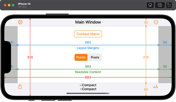
When Display Zoom is enabled, the iPhone 14 shows a zoomed up resolution of 320×693 points. This is the same resolution as the iPhone 11 Pro and iPhone 12 mini with Display Zoom but the iPhone 14 has slightly different bar heights.

iPhone 14 Plus
The iPhone 14 Plus has the same size and behaviour as the iPhone 12 Pro Max and 13 Pro Max. The notch is narrower on the 14 Plus and 13 Pro Max than on the 12 Pro Max.
Standard Zoom
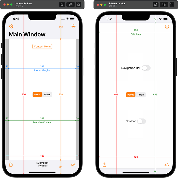
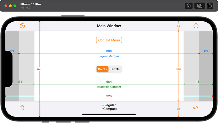
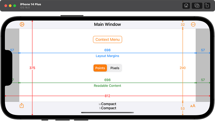
The iPhone 14 Plus has a resolution of 428×926 points at its native resolution.
Display Zoom
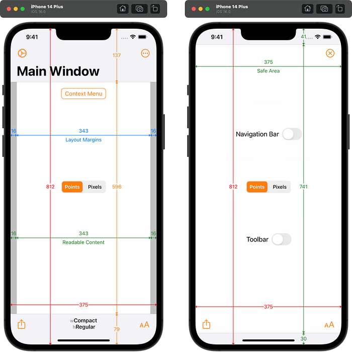
When Display Zoom is enabled, the iPhone 14 Plus shows a zoomed up iPhone 11 Pro resolution of 375×812 points but with slightly different bar heights.
iPhone 14 Pro
Standard Zoom
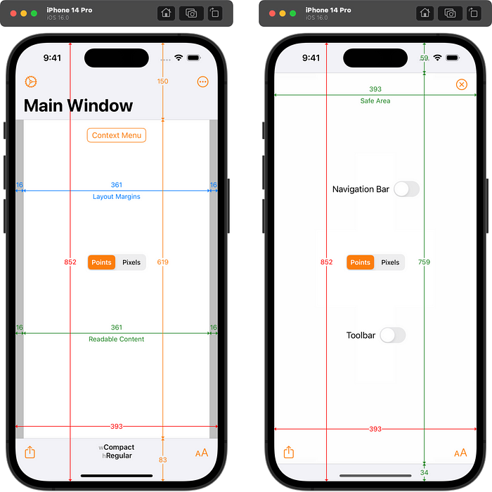
The iPhone 14 Pro has a slightly larger resolution of 393×852 points at its native resolution than the iPhone 14’s 390×844 points. Since this is a new resolution, apps must be built with Xcode 14 or later to see it. The status bar is 12 points taller than the iPhone 14 to account for the Dynamic Island. The total navigation bar height (including the status bar) is only 7 points taller. The bottom bar is unchanged.

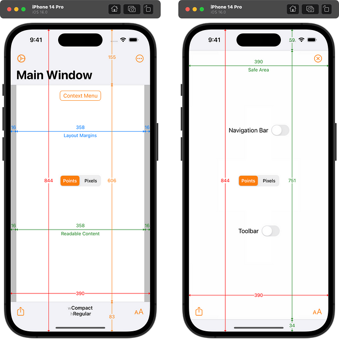
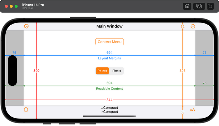
Apps built with Xcode 13 or earlier will see a zoomed up iPhone 14 resolution of 390×844 points but with a 12pt taller status bar and navigation bar in portrait. NOTE: this extra 12pt only seems to happen on the simulator. Real iPhone 14 Pro devices report the same 143pt navigation bar and 47pt status bar as the iPhone 12 Pro and 13 Pro.
Display Zoom
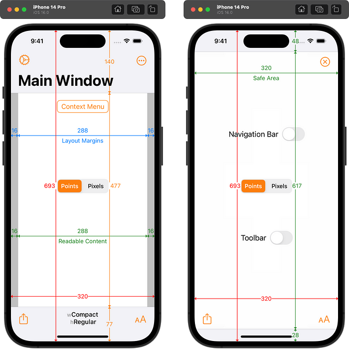
When Display Zoom is enabled, the iPhone 14 Pro shows a zoomed up resolution of 320×693 points. It does not matter which version of Xcode the app is built with. This is the same resolution as the iPhone 11 Pro with Display Zoom but the iPhone 14 Pro has slightly different bar heights.

iPhone 14 Pro Max
Standard Zoom
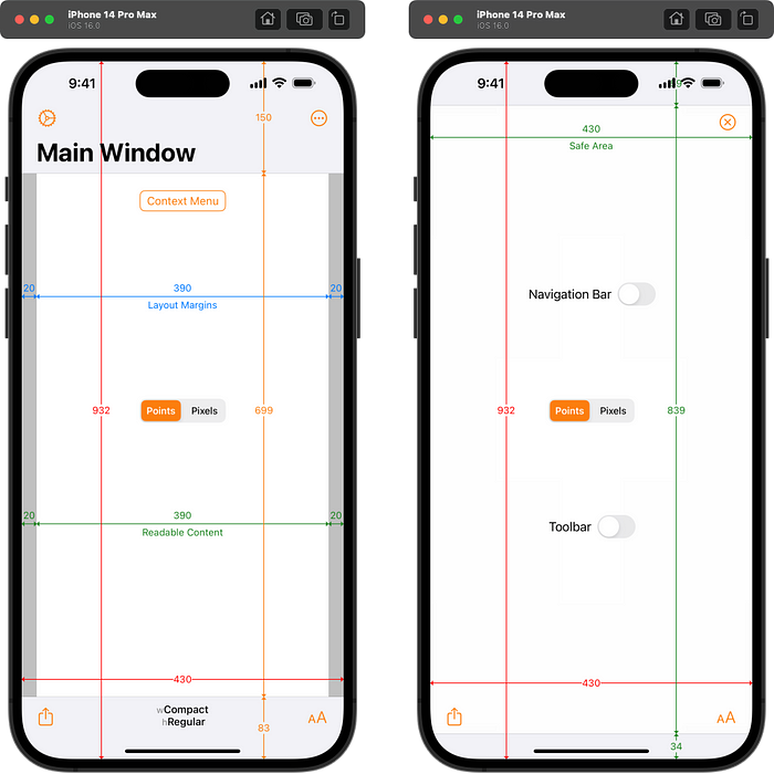
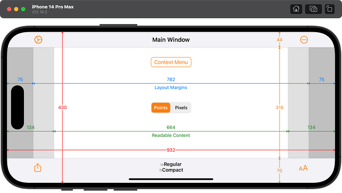
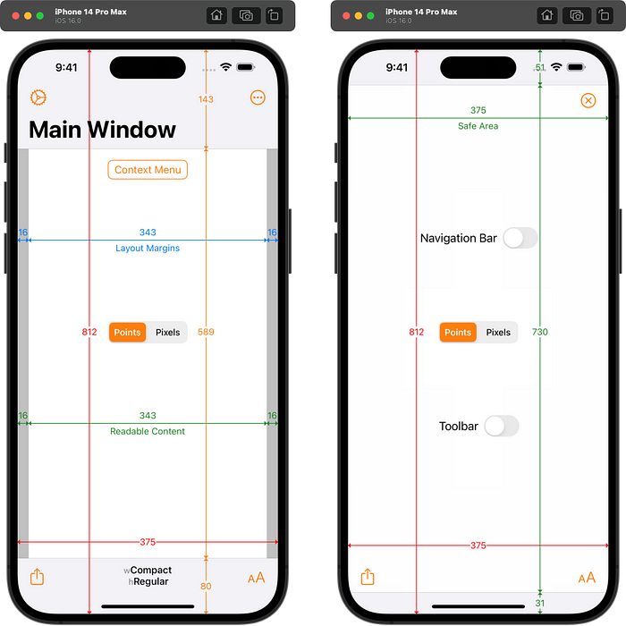
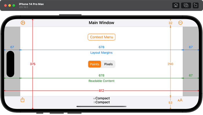
The iPhone 14 Pro Max has a slightly larger resolution of 430×932 points at its native resolution than the iPhone 14 Plus’s 428×926 points. Since this is a new resolution, apps must be built with Xcode 14 or later to see it. The status bar is 7 points taller than the iPhone 14 Plus to account for the Dynamic Island. The total navigation bar height (including the status bar) is only 7 points taller. The bottom bar is unchanged.
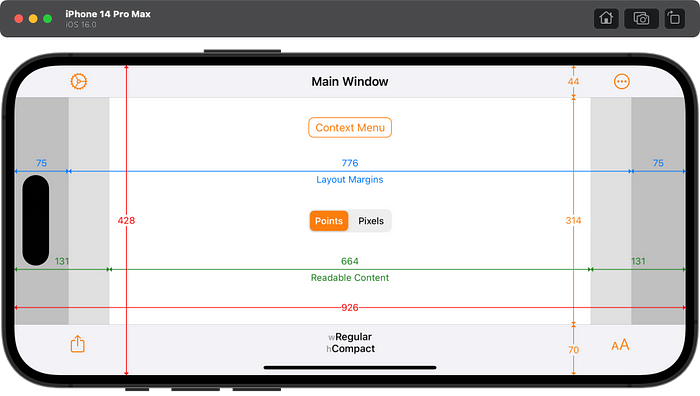
Apps built with Xcode 13 or earlier will see a zoomed up iPhone 14 Plus resolution of 428×926 points but with a 12pt taller status bar and navigation bar in portrait. NOTE: this extra 12pt only seems to happen on the simulator. Real iPhone 14 Pro Max devices report the same 143pt navigation bar and 47pt status bar as the iPhone 12 Pro Max and 13 Pro Max.

Display Zoom
When Display Zoom is enabled, the iPhone 14 Pro Max shows a zoomed up resolution of 375×812 points. It does not matter which version of Xcode the app is built with. This is the same resolution as the iPhone 11 Pro but the iPhone 14 Pro Max has slightly different bar heights.
Conclusion
Apple have an excellent track record of providing backward compatibility with existing apps when new devices or versions of iOS are released. The iPhone 14 Pro models are no different. Bar heights when scaling do not match the original device in the simulators but do seem to match on real devices. To see the new resolutions of the iPhone 14 Pro and 14 Pro Max, apps must be built with Xcode 14 or later.
To add more confusion, it seems that iPhone 14 Pro devices running TestFlight builds made with Xcode 14 are behaving as if they were Xcode 13 builds. That is, the iPhone 12/13 Pro layout is being scaled to fill the larger screen of the 14 Pro devices. This explains why Simon Støvring was seeing different behaviour when running through Xcode or a TestFlight build. Hopefully that will be fixed soon, but Anton Sotkov has seen it in Xcode 14.0 and 14.1 beta 2, and with iOS 16.0 and iOS 16.1 beta 2.
Adaptivity
The screenshots in this article were taken from my Adaptivity app. It is primarily a tool to visualize the different window sizes, layout margins, readable content guides, bar heights and Dynamic Type sizes that a modern, adaptive, iOS app uses when running on different devices and iPad multitasking sizes. This makes it the perfect tool to investigate the changes in appearance and behaviour of new devices. The layout views are also a great way to see how Stage Manager behaves and how apps transition between the different fixed sizes when resized and, when crossing a threshold, flip between compact- and regular-width size classes.
The app also includes views for browsing System Colors, System Images (SF Symbols), System Materials, System Fonts and more. Full information on all of Adaptivity’s features is available on my web site.
Other Articles That You Might Like
I have written a whole series of articles explaining the changes that have occurred to SF Symbols since their introduction in iOS 13. The most recent, SF Symbol Changes in iOS 16.0, has links to all the earlier articles. They demonstrate some of the superior features of Adaptivity’s SF Symbol browser compared with other browser apps.
I have also written articles on View Controller Presentation Changes in iOS and iPadOS 16, Xcode Build Times with Custom SF Symbols, How iPad Apps Adapt to the New 8.3" iPad Mini, How iOS Apps Adapt to the various iPhone 12 Screen Sizes, Bringing Adaptivity to Mac Catalyst, How to Switch Your iOS App and Scene Delegates for Improved Testing, View Controller Presentation Changes in iOS 13 and how to Hide Sensitive Information in the iOS App Switcher Snapshot Image.
The search algorithm used in Adaptivity’s System Colors and System Images views is described in A Simple, Smart Search Algorithm for iOS in Swift.
If you found any of these articles helpful then please take a look at my apps in the iOS App Store to see if there’s anything that you’d like to download (especially the paid ones 😀).
If you work with a lot of Xcode projects you might like my Mac Menu Bar utility XcLauncher. It’s like having browser bookmarks for your favorite Xcode projects, workspaces, playgrounds, and Swift packages. There is more information on my website about XcLauncher’s features.
